
DeCruz Ballet
Started by two former Principal ballet dancers, DeCruz Ballet specializes in preparing students for life as a professional dancer. While their focus is to help dancers become well-rounded through a variety of fitness and dance classes, the same regimen is open to anyone looking to stay active through exercise.
Through a research and discovery process, DeCruz Ballet needed a cohesive brand as sophisticated as their teachings and as welcoming as the owners. The new branded system is evocative of a high-end experience while standing apart from their competitors.
- Logo Design
- Visual Identity
- Website Design
Secondary Marks
Color Palette
Visual Identity
Discovery
After interviewing co-owners Lindsi and Karel, the re-branding of their new company was a necessary step to convey the new dance studio’s professionalism.
The new look needed to reference the grace and precision found in ballet through a consistent branded system — in order to build the trust of potential students and their parent(s) or guardian(s).
When they audition, kids will get typecast by only training in one style. DeCruz Ballet doesn’t have a specific style. We study all types. It’s a mishmash.
Lindsi D.
Treating [students] like they’re already professionals so when they step into the dance world they don’t feel out of place. We want them to leave feeling like a pro.
Lindsi D.
We want to be inviting. We want people to see that our backgrounds and reputations are good.
Karel C.
Simple. Efficient. Precise. Just like ballet — very much to the point.
Lindsi D.
Mark
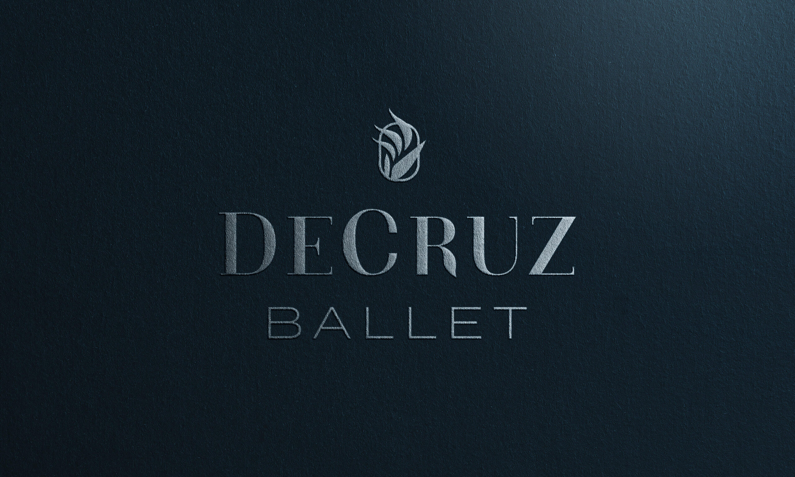
DeCruz Ballet’s new logo is a nod to the visual language of the ballet industry, while also conveying the grace, elegance, and precision found in professional dancers.
The mark uses a bird of paradise to represent the fire and passion the owners bring to their love of dancing and teaching. While the oval the flower is nested in is an abstract representation of a pointe shoe.

Modified Logotype
Starting with a didone typeface, a lot of the harsh angles and flourishes were modified to add movement and create structured precision. The new “R” adds a welcoming touch to match the organic feel of the mark.
Completely custom, the “C” is formed from the overlapping of two “C’s” since the name “DeCruz” is the coming together of the two co-owners last names, “Dec” and “Cruz.” It’s representative of their journey in this new business together and can be seen through their branded materials.

Logo
DeCruz Ballet’s new logo is a nod to the visual language of the ballet industry, while also conveying the grace, elegance, and precision found in professional dancers.
The flower, a bird of paradise, is a representation of the co-owners love of all things tropical, the passion they bring to their craft, and the growth students will undergo while in the program.
Secondary Marks
Additional branded elements are versatile enough to be used across their marketing materials as a stand-in for their logo.
The “B” and “F” help to visually distinguish between their ballet and fitness classes. While the “C” in the sun represents the joy and gratitude the owners embody. The C in flames works as a condensed version of their logo.


Color palette
After analyzing local ballet, dance, and fitness studios, it became clearer that one of the ways DeCruz needed to stand out from the competition was through their brand colors.
The majority of businesses in the local area used bright shades of pink, red, or grey. DeCruz’s color palette draws from the owners love of navy and expands the dark tone with some gender neutral powder blues. Natural tans help to add warmth and sophistication to the new palette.

Visual Identity
Blended organic lines are used throughout the designed system as a visual representation of the kinetic movement found in dance.
The paths are also a representation of the way light reveals the guide lines on the flower structure of a bird of paradise’s leaves and petals.


Website Design
Since the client’s site runs through Squarespace, the design needed to be as simple as possible while still feeling like an extension of the brand.
Additional freelance copywriting services were provided to make sure the language was the perfect fit for their audience. Some copy was repurposed from the client’s previous site and edited to fit with the brand language uncovered during research and discovery.


Open to freelance work.
While I work as a full-time graphic designer, I thoroughly enjoy connecting with people to help design solutions to any problem. Send me an email or DM me on Instagram if you’ve got a question.
©2020 CJakubo. All Rights Reserved.