Counterbalance Counseling provides clients with a sense of safety and hope while helping them get started on their journey, work through their problems, and towards their goals with therapy.
In need of an elevated rebrand, the new design system needed to come across competent, professional, and modern while catering to the clients love of nature, open space, and desire for calm.
- Logo Design
- Visual Identity
- Website Design
Discovery + Messaging
An interview with the client (conducted by HDM’s Head of Strategy) revealed that a progressive attitude and excellent service were important to the company and its clientele.
The rebrand needed to come across competent, professional, and non-judgmental while connecting with a younger demographic to make them feel seen and heard. Messaging for this project was created by HDM’s marketing team and copywriter.
Too much of anything is bad for you. When things are too far in one direction you need a counterweight, a counterbalance, that’s what therapy can be.
Sydney M.
Some people are very concrete. But that shifts over time to something a bit more abstract. We have to figure out why something is happening.
Sydney M.
We’re going to take care of you, have a good relationship, and give you the best care we can.
Sydney M.
One thing I wish I could do for my clients: Would have a wand to take away the hurt.
Sydney M.
Mark
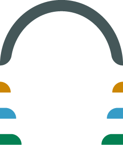
After some sketching and ideation, the symbolism behind a feather worked best for the client’s mark while helping them stand out in their industry.
Seeing a feather can be taken as a sign of being on the right path. Hummingbirds are seen as symbols of adaptability and guidance. Counterbalance’s mark uses a hummingbird feather to symbolize how their counselors work as guides to help you create balance in your life.

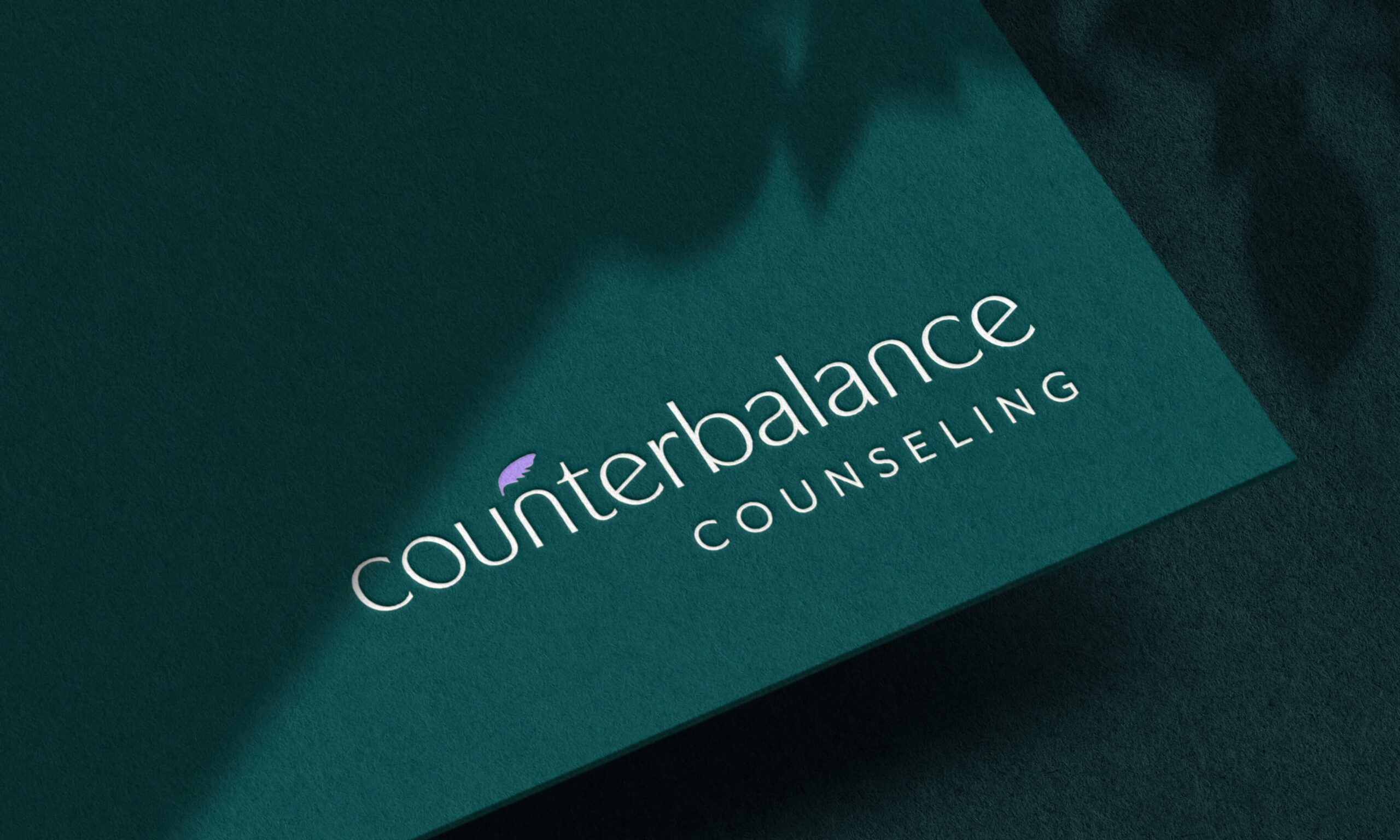
Modified Logotype
It was important that the typeface used for the base of the logotype have the characteristics of an older style while still feeling modern and new.
The “O” and “E’s” in the typeface have been tilted and modified to add a counterweight to the logotype. While the “U” and “N’s” work as inverses of each other. The logotype is kept in all lowercase to add a slightly casual touch.

Logo
Since the client expressed a love of high-end and down-to-earth brands the logo uses a combo of both moods to create a professional, clean cut logo with a touch of fun.
The entire logo is right-aligned to give it an asymmetrical balance not typically seen in logo design while still making it feel grounded to an edge. Pairing a lowercase and all caps type together help give off the feeling of two extremes working in unison.
Pattern
The repetition of simple, structured lines comes together to create a geometric abstraction of a hummingbird’s feathers. The pattern is used both in a solid bright color or in a gradient.
The subtle pattern of abstract feathers repeats across the website and other printed collateral. It reinforces the symbolism of the brand and alludes to the idea of the feather without the logo or mark needing to be present.

Color palette
Bright pops of blue and purple add a more youthful energy while being balanced out with neutral tones. Emerald greens help add a touch of sophistication and maturity to the palette.
The new brand uses a mixture of the cool blue and purple tones to create a calming, yet lively gradient symbolizing the ebb and flow of water — adding another symbol to nature and all things organic for the brand.

Visual Identity
Inscriptional and sans serif typefaces were chosen that would pair nicely with the logo and convey a modern vibe with a nod to something a bit older and classic.
The branded system adds a healthy dose of white space to ensure plenty of breathing room and convey the practice’s open and accepting attitude. Printed materials use playful asymmetry while working along a grid to ensure organization and consistency.


Website Design
Since it needed to fit within the constraints of a template website structure, it was important to keep the most notable brand aspects recognizable throughout the website design.
The new site design uses the blue/purple gradient and deep emerald greens to draw attention to important call to actions. Plenty of white space is used on each page, across desktop and mobile, to keep the mostly text-only pages light, accessible, and easy to skim.


Hot Dog Marketing
Strategy
Kevin Ring
Art Director
Brandon Cornwell
Marketing Director
Cathy Edison
Copywriter
Tom Snyder
Personal Contributions: Visual Brainstorming + Ideation, Mark and Logo Design, Color Palette, Pattern Design, Typeface Selection, Visual Identity (Business Cards, Letterhead, Tote Bag Design, Pen Design)
Open to freelance work.
While I work as a full-time graphic designer, I thoroughly enjoy connecting with people to help design solutions to any problem. Send me an email or DM me on Instagram if you’ve got a question.
©2020 CJakubo. All Rights Reserved.