Blair Landscape Architecture, LLC
BLA is an Austin-based firm focused on designing commercial landscapes that compliment the physical building and align with the architect’s intended goals.
The firm was only looking for a brand refresh that needed to come across knowledgable, artistic, and detail-oriented kept light on aesthetics to appeal to their clients and civil engineers.
- Logo Design
- Website Design
01. The Refresh
02. The Revamp
03. The Reinvention
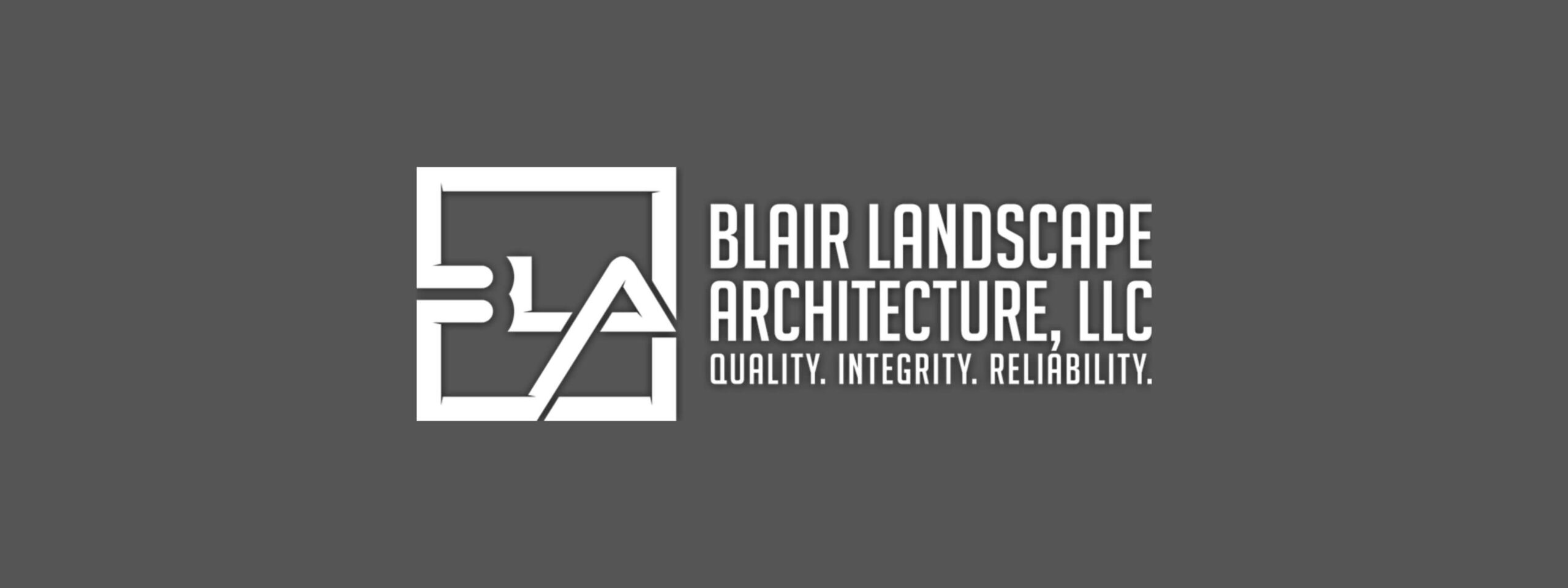
Original Logo
01. The Refresh
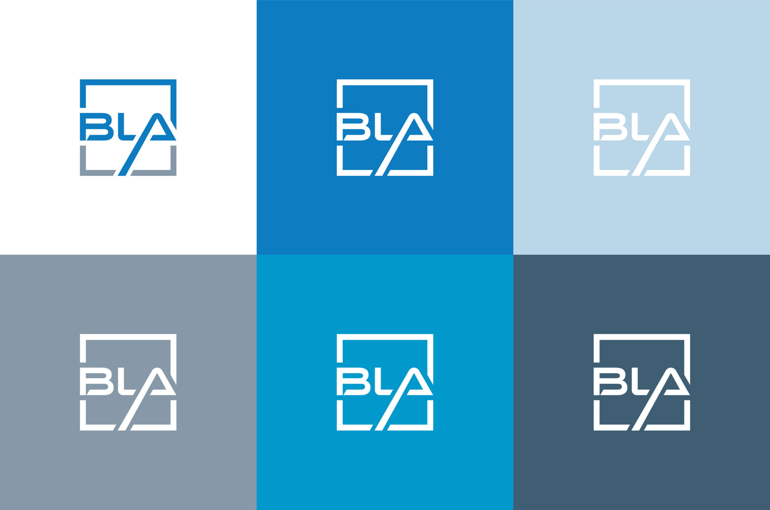
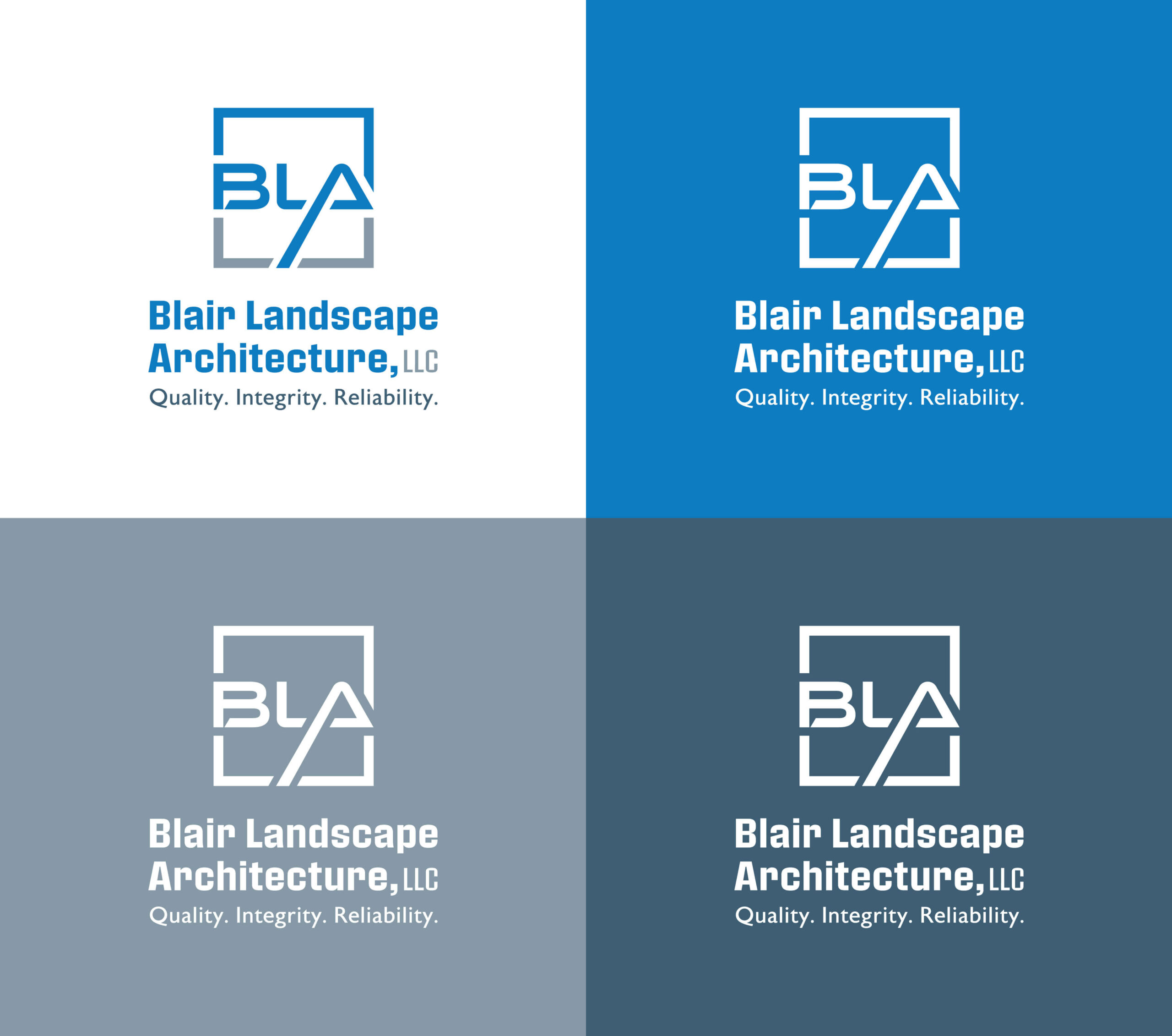
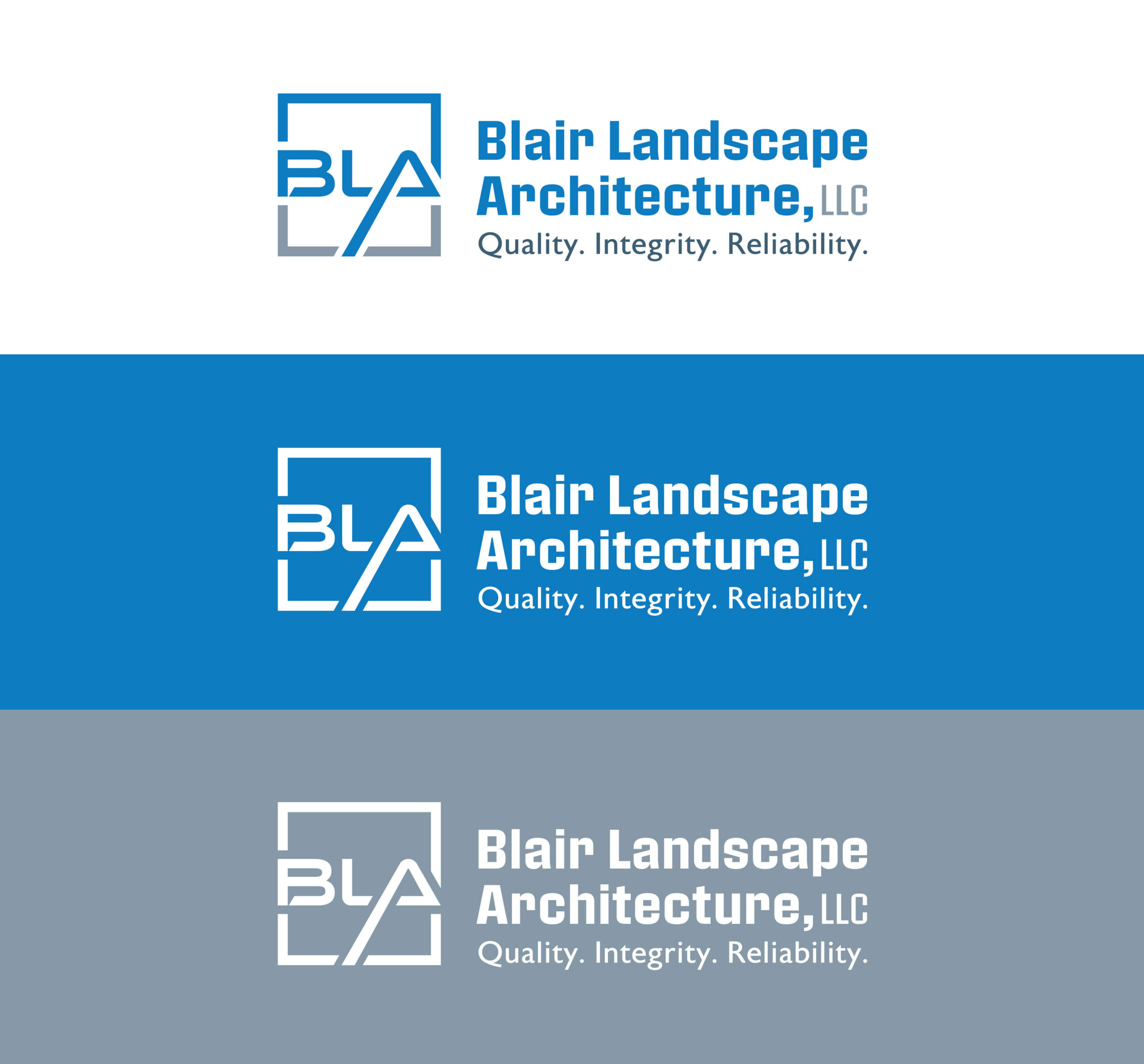
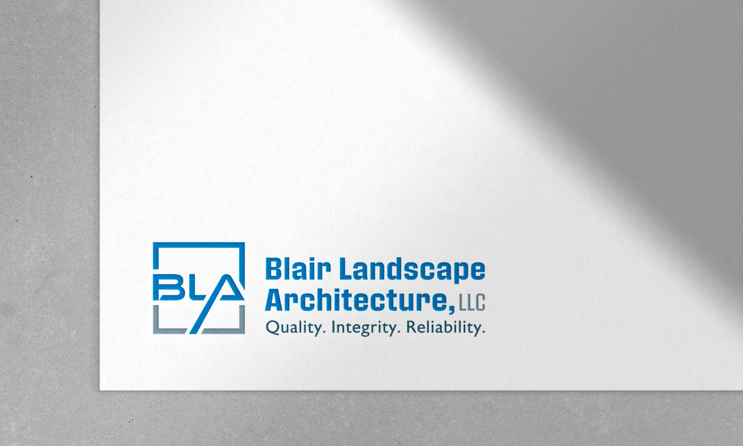
Concept one cleans up on the lines on the original mark to eliminate any confusion in the mark’s readability and create more of a “frame.”
Keeping with the notches from the previous logo, the new mark includes a small cut in the “B” to create a talk bubble —subtly referencing what BLA is known for: client communication and good relationships.
Color palette
Concept one’s palette works to elevate and expand the Blair Landscape’s two original colors: blue and slate grey.
The colors found on their site and logo were altered and used as the starting point for the refreshed color palette with a variety of complimentary cool and vibrant tones.

Website
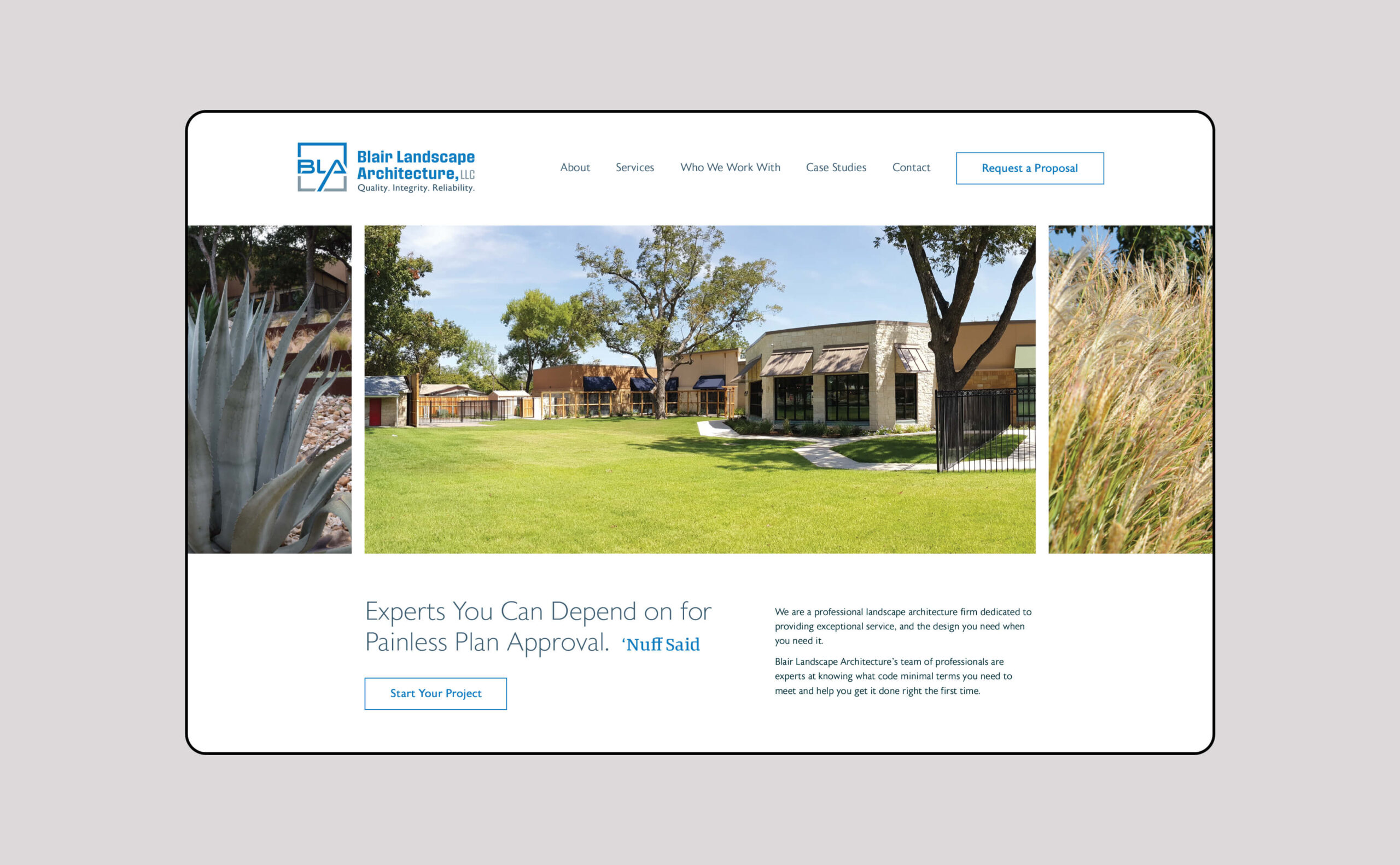
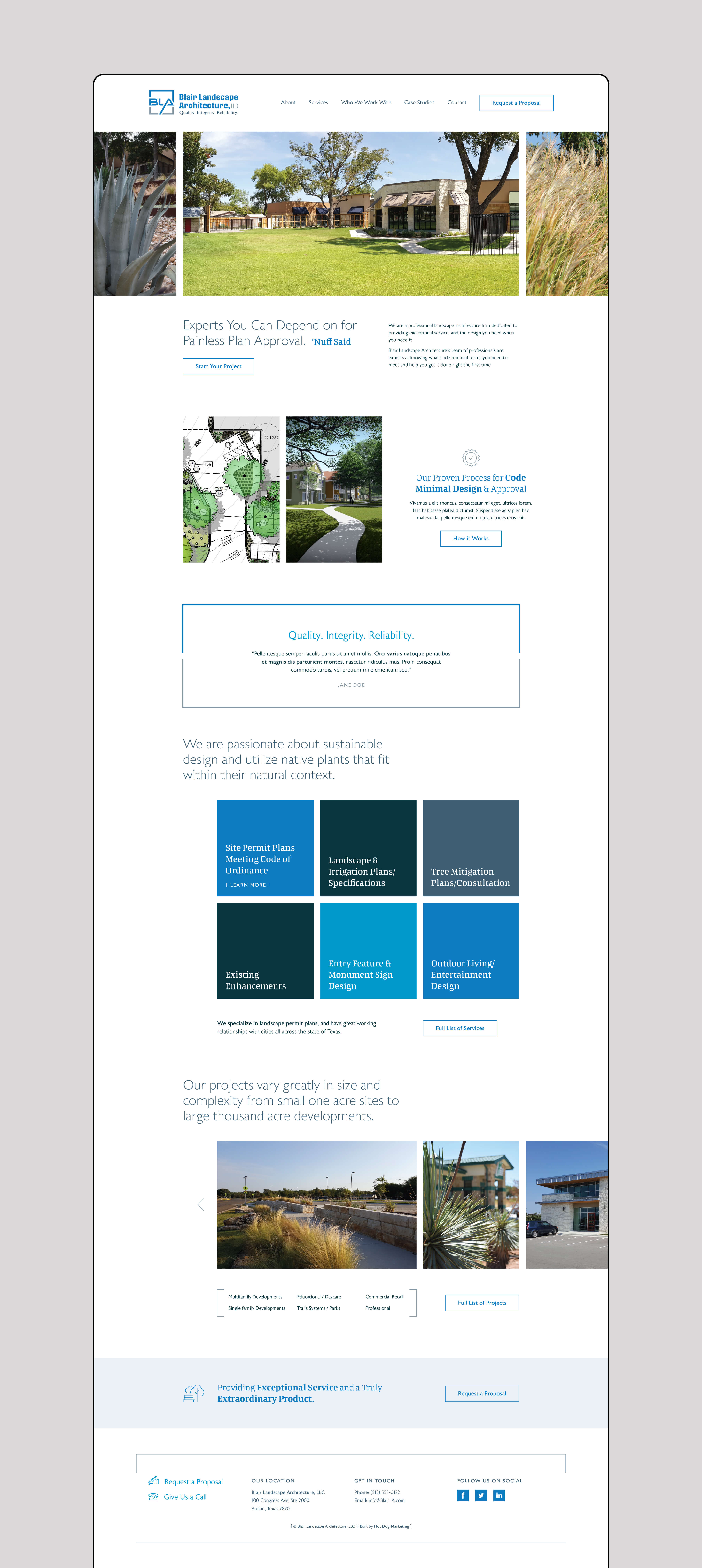
The homepage design focuses on using as much white space as possible to allude to the idea of starting on a “blank page” full of possibilities.
The idea of the “frame,” from the mark, is continued and repeated throughout the site design. Color is used sparingly and used to draw the audience’s attention.
02. The Revamp
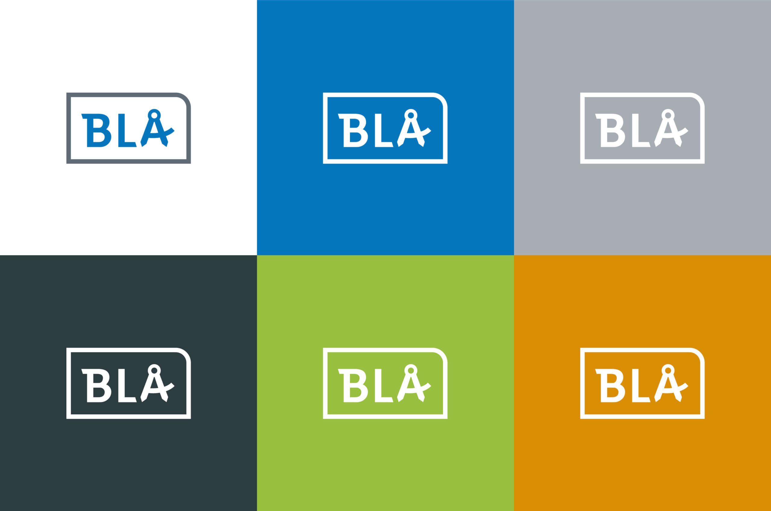
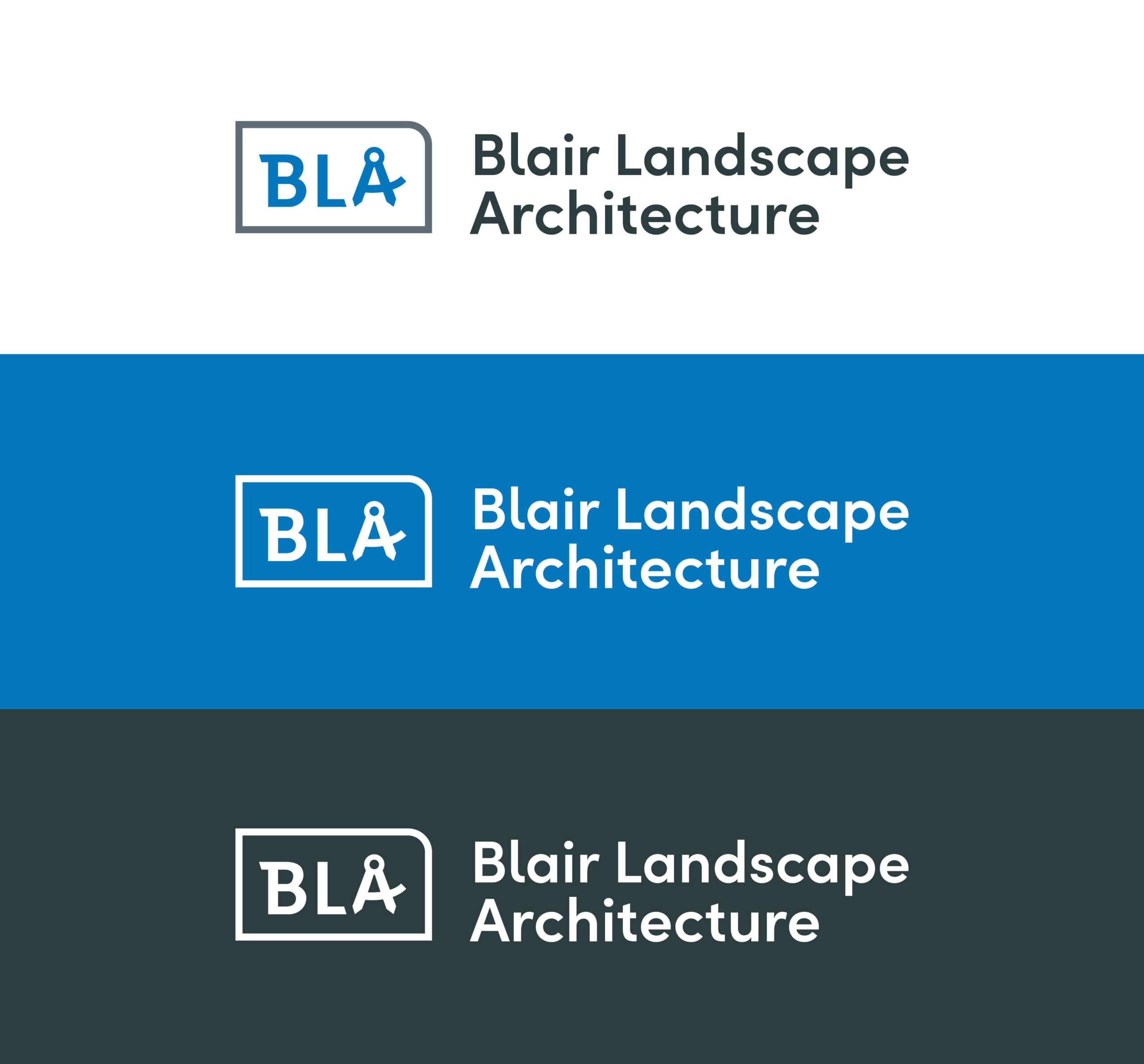
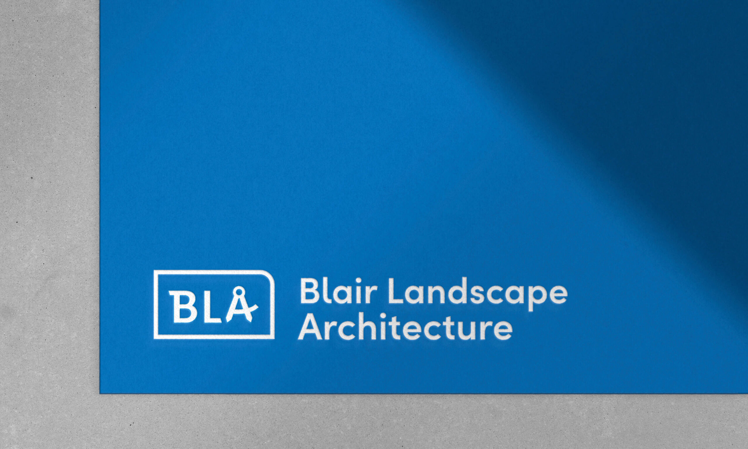
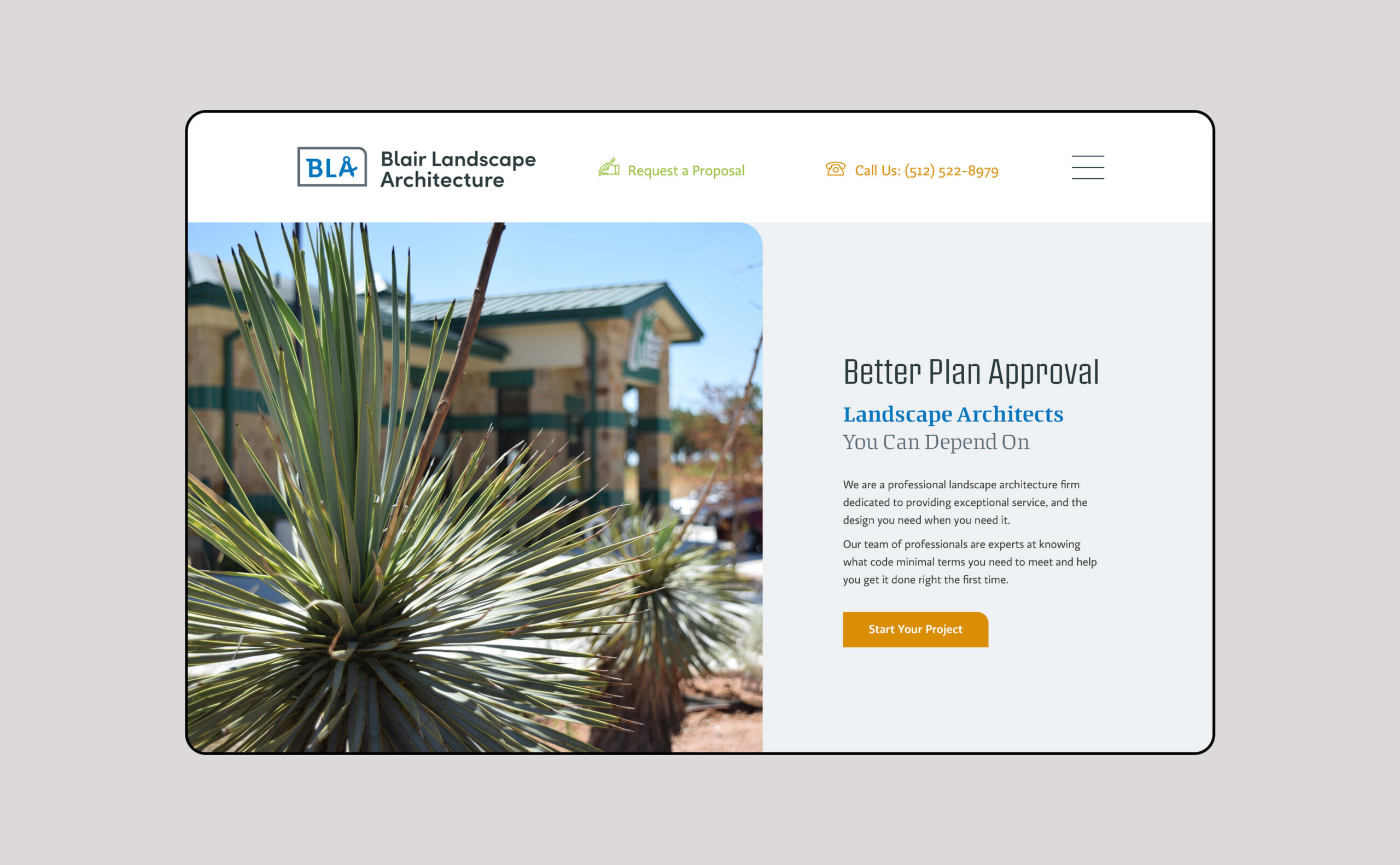
Keeping with the original logo’s use of initials in a square, concept two reworks the previous design into a fun yet refined badge of authority.
Curving one of the corners of the rectangle adds to the feeling of a badge or tab. While the “A” has been modified to reference a compass. The revamped concept alludes to the precision and planning found in BLA’s work.
Color palette
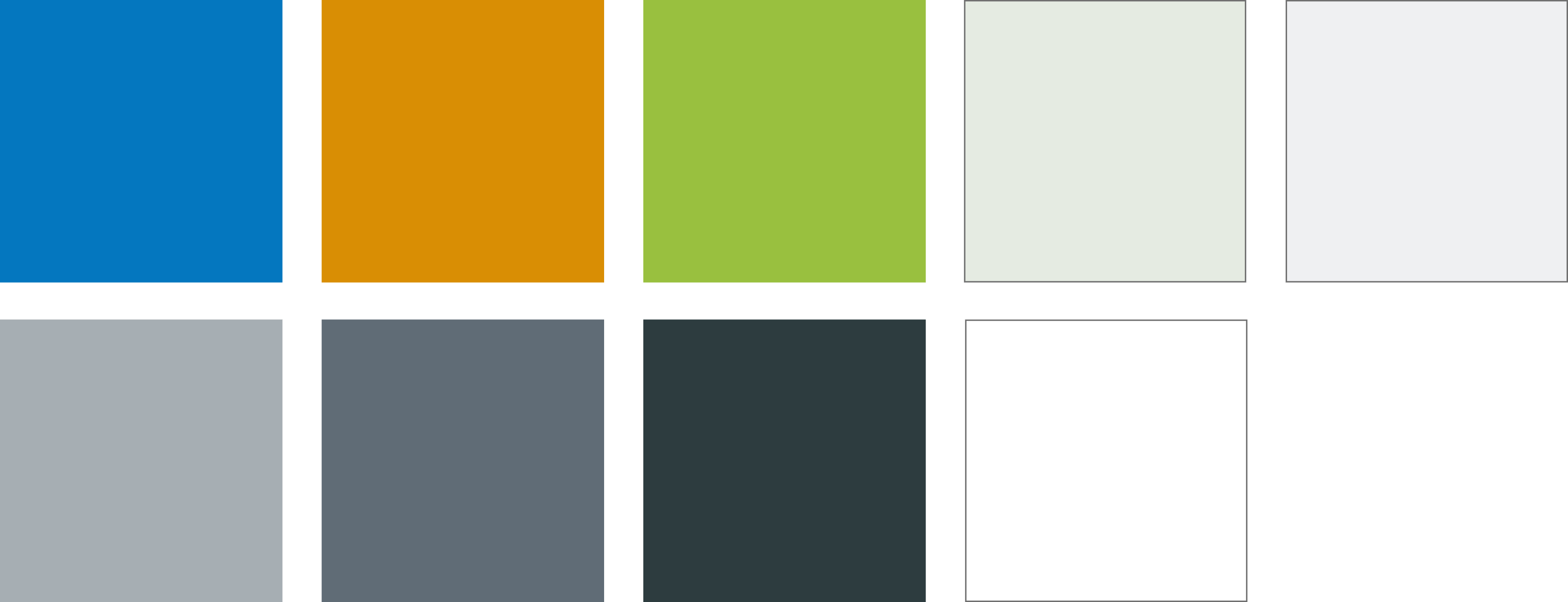
Starting off with a more vibrant hue of their previous blue, this palette adds two contrasting pops of secondary and complimentary colors.
The concept’s color palette works with three tonally similar, bright hues to add a touch of fun. To keep everything sophisticated and professional, neutral greens, greys, and blues are added in for some balance.
Website
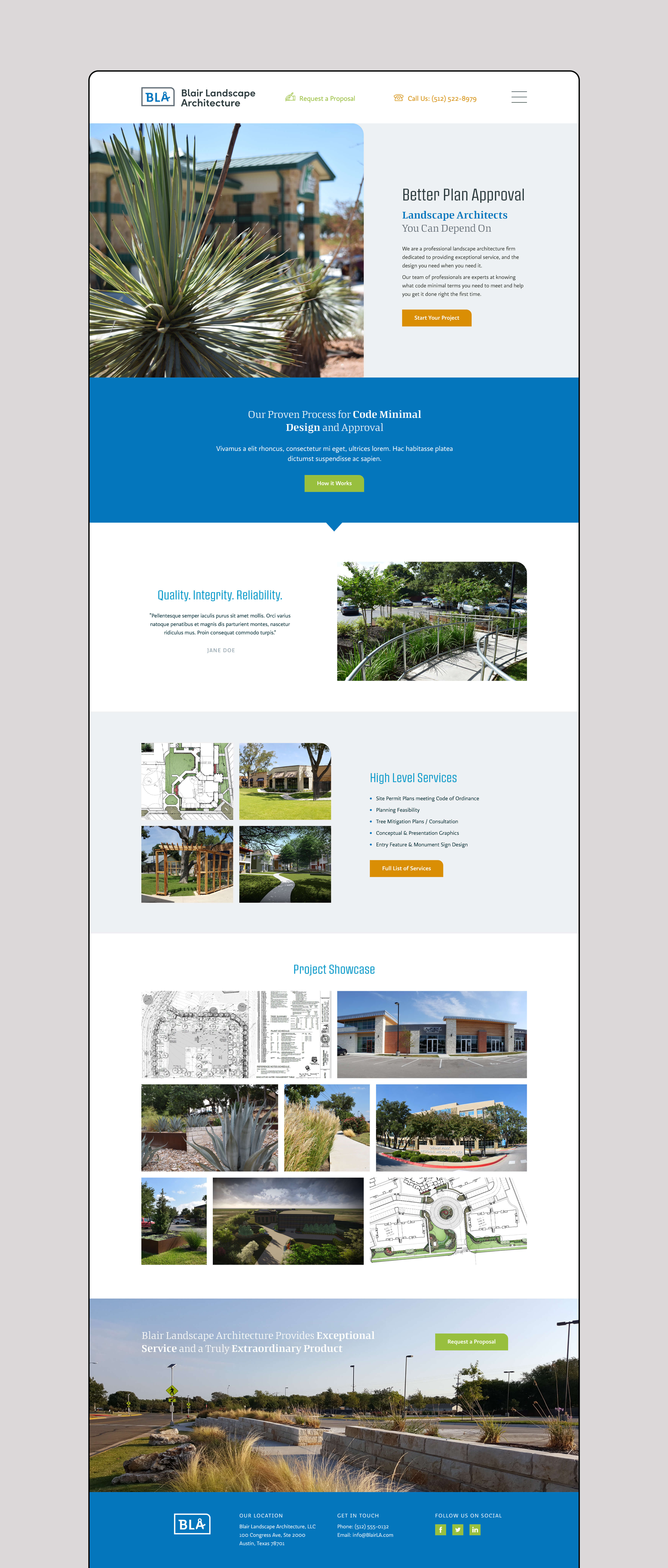
In contrast to the other two homepage designs, concept three uses a heavy amount of photos to showcase the firm’s work and establish trust.
Concept two’s site design keeps everything very simple and structured in an expected and confined grid that would appeal to government workers, civil engineers, and let the photos of their work shine.
03. The Reinvention
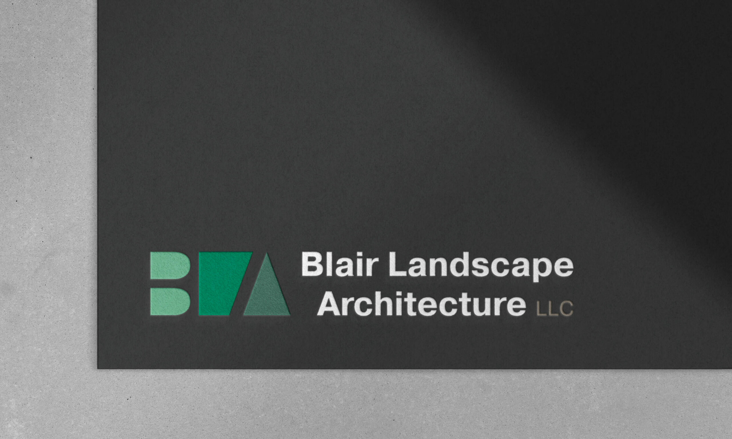
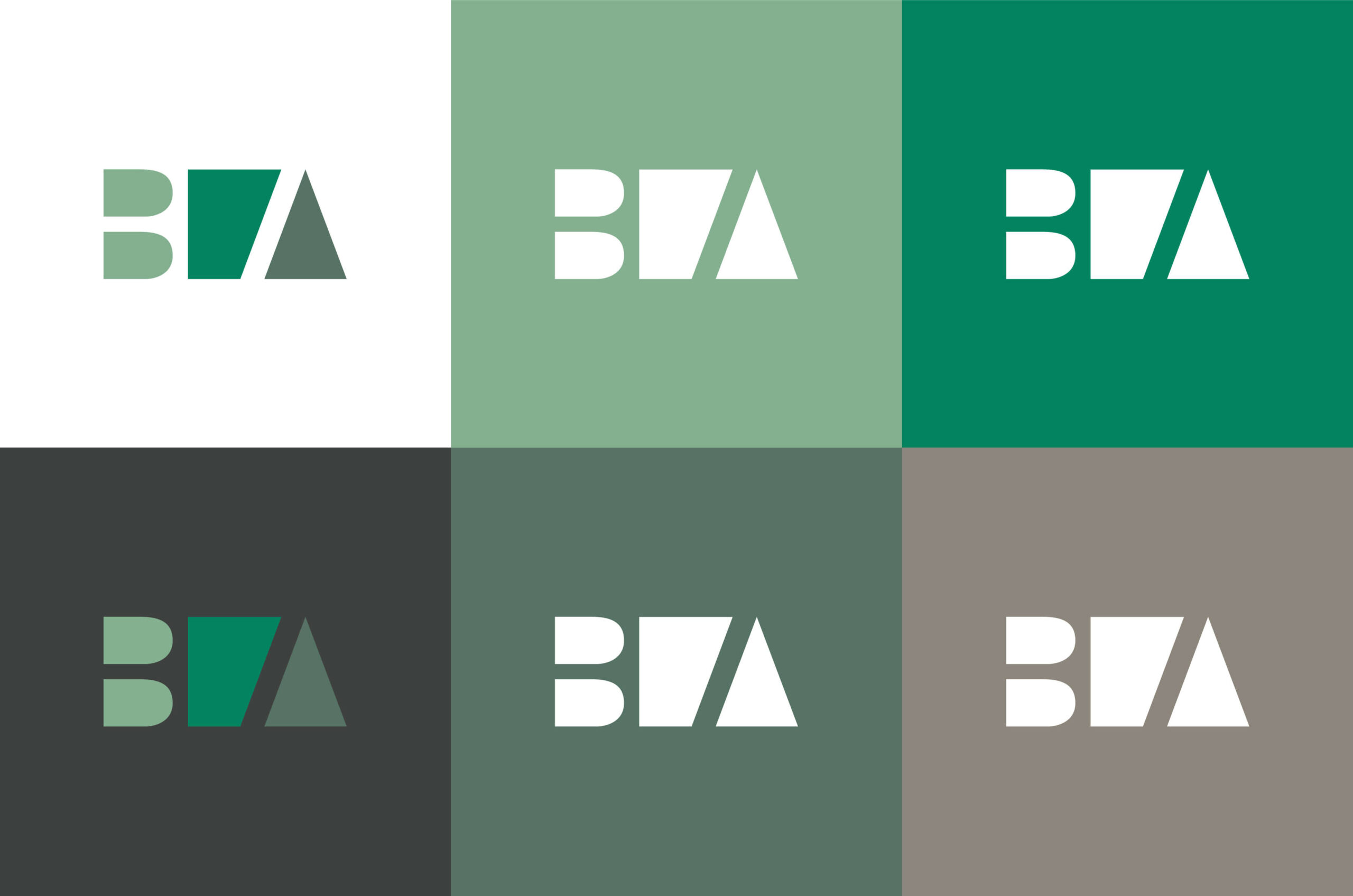
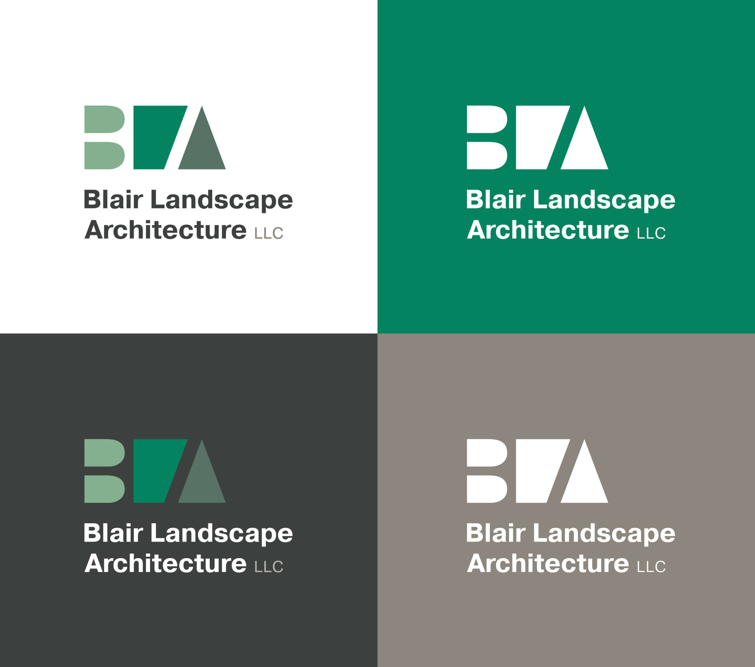
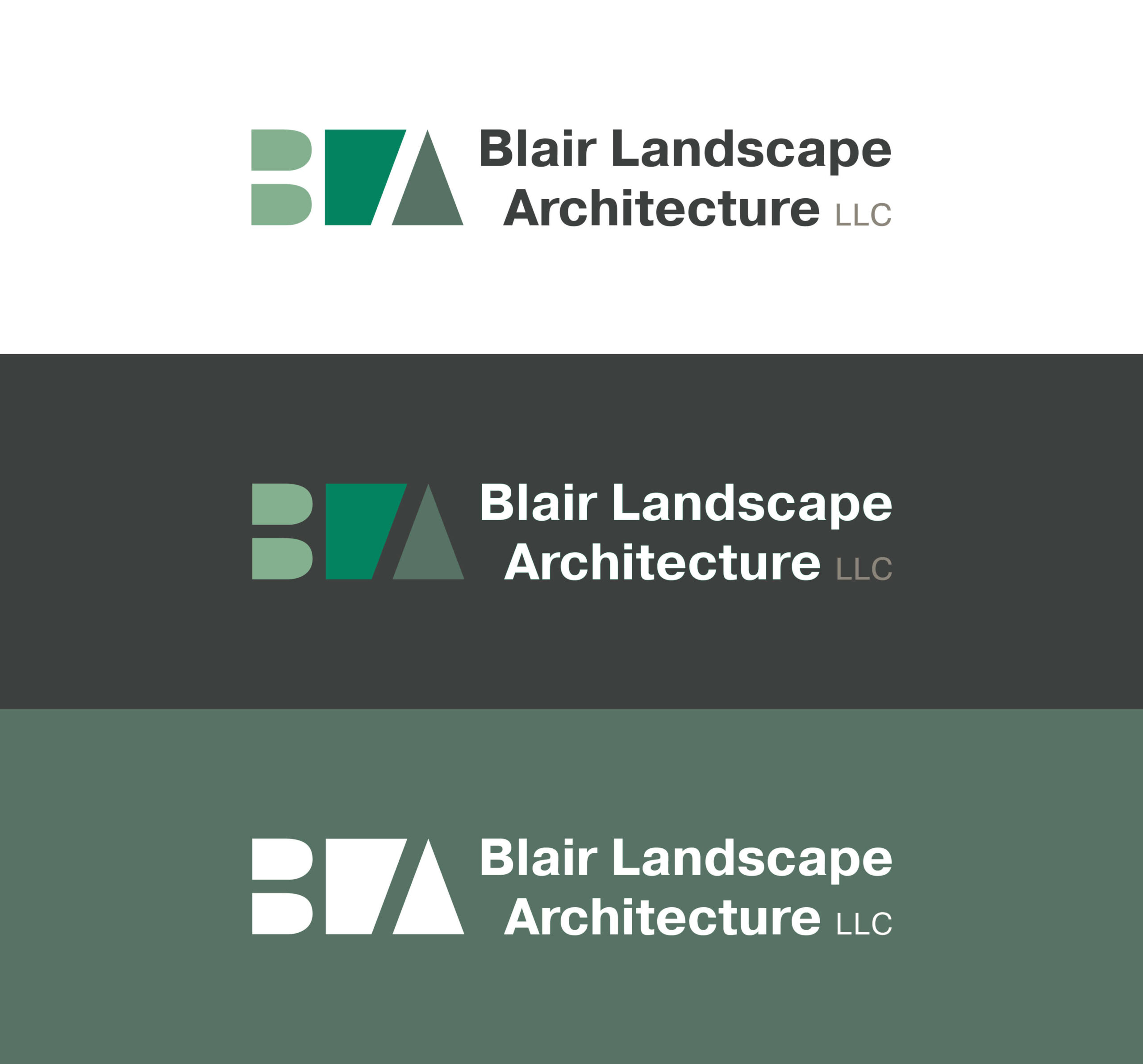
Focusing on the negative space the original logo was going for, concept three uses the counters from the B and A to expand the mark into an abstract representation of plots of land.
The geometric and modern mark is paired with a typeface that alludes to something a bit more traditional while still having a touch of a contemporary feel. While it does include the “LLC” it leaves out the tagline to keep things clean.

Color palette
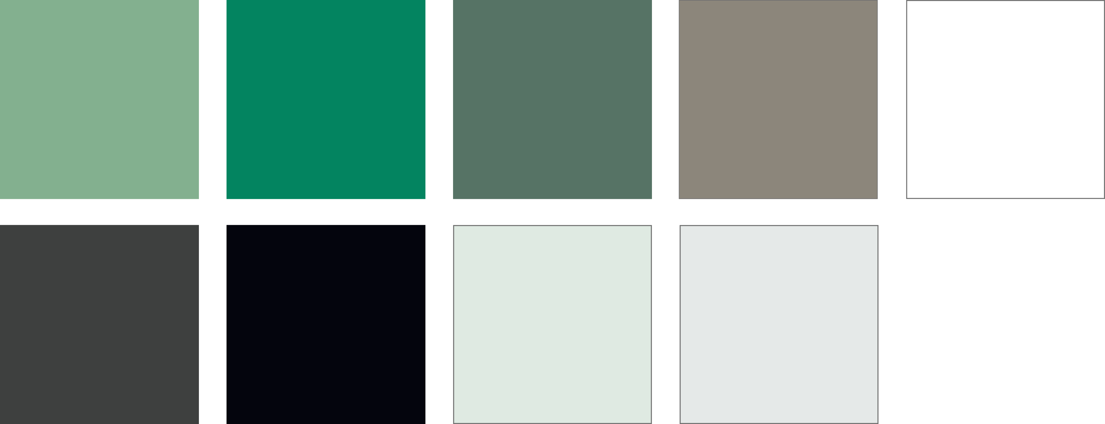
Focusing on a lush, yet sophisticated assortment of greens and browns, concept three’s palette heavily represents the natural elements.
Concept three’s palette heavily represents the work done by the local landscape architecture firm — all things green, earthy, and natural.
Website Design
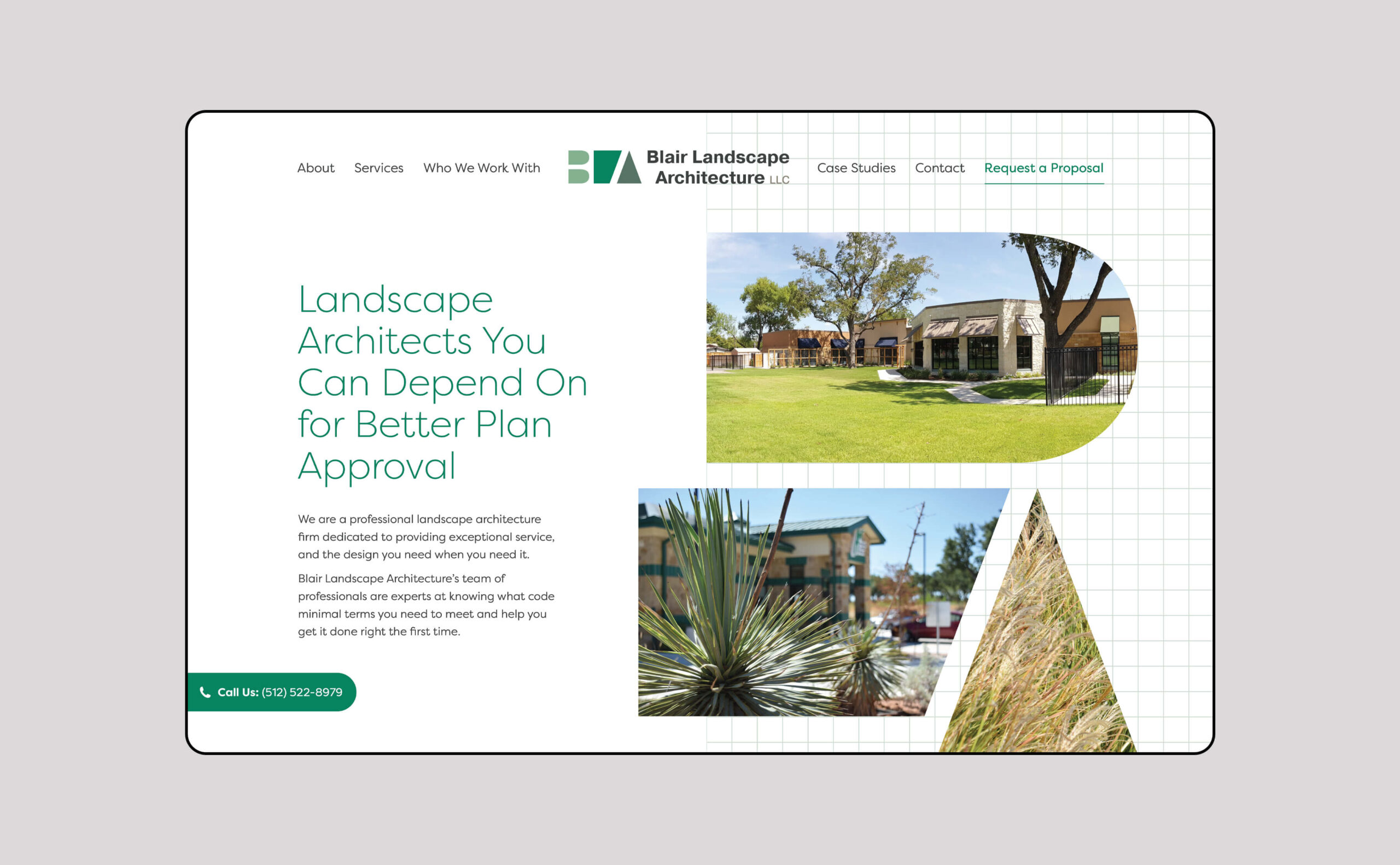
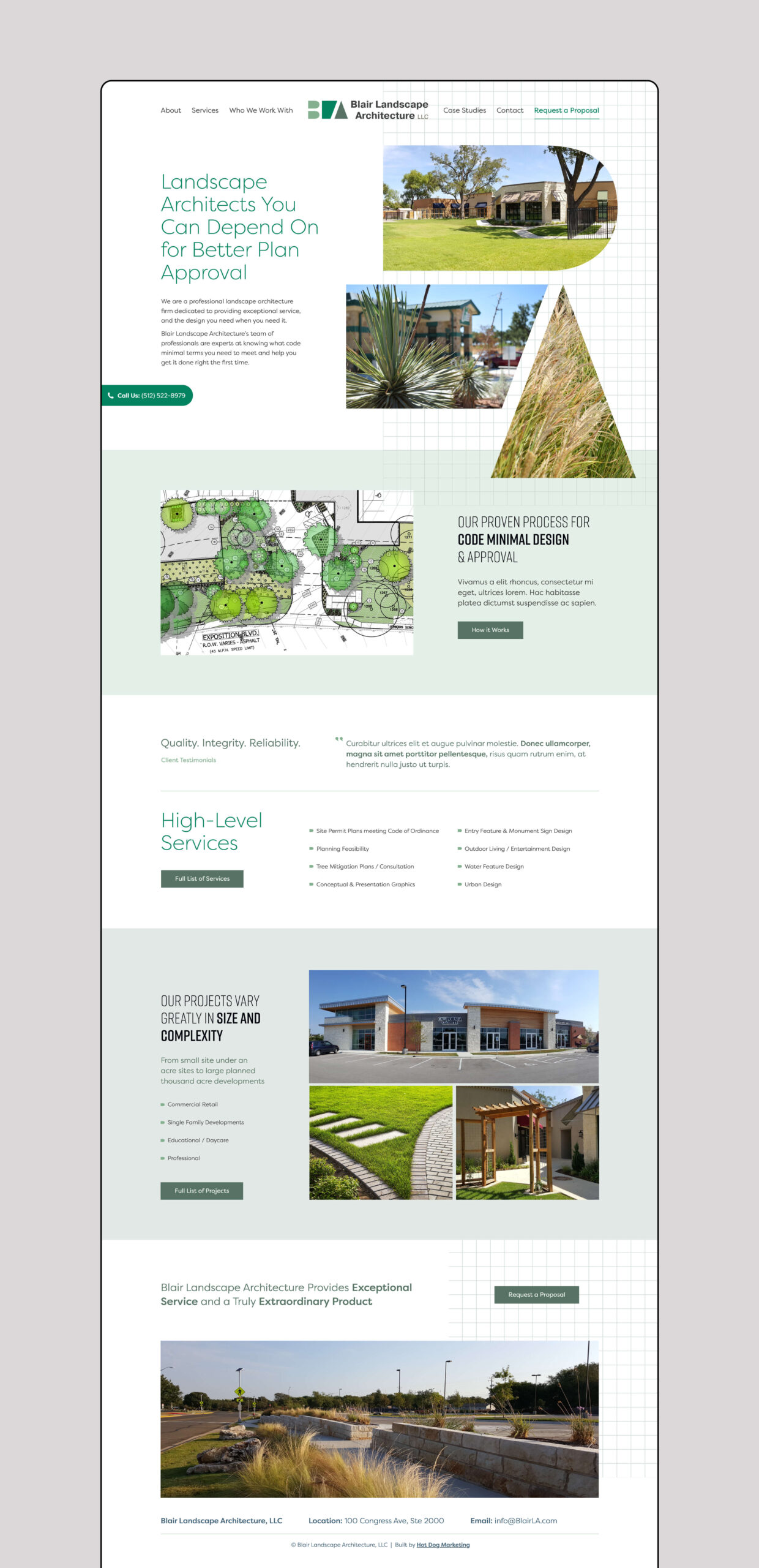
Since the logo and mark build off the idea of geometric plots of land, the home page design expands off this concept with a grid element.
The firm is known for having plans so precise that even the construction crew is informed. So, the website design focuses on conveying this level of sophistication, organization, and structure.
Next Steps
Although I was only able to take part in these first concepts, I thoroughly enjoyed designing the three different directions for BLA’s refresh.
While I wasn’t able to see the project through any subsequent design phases, the client did prefer the third concept — the reinvention of the original logo.
Hot Dog Marketing
Strategy
Kevin Ring
Art Director
Brandon Cornwell
Marketing Director
Cathy Edison
Copywriter
Tom Snyder
Personal Contributions: Visual Brainstorming + Ideation, Refresh of Original Mark and Logo, Mark and Logo Design for Concept 02 and 03, Color Palettes, Typeface Selection, Homepage Designs
Open to freelance work.
While I work as a full-time graphic designer, I thoroughly enjoy connecting with people to help design solutions to any problem. Send me an email or DM me on Instagram if you’ve got a question.
©2020 CJakubo. All Rights Reserved.
