
Project Arro
An acronym for, “Activation. Recovery. Response. Operations” ARRO is a modern automated alternative for emergency payroll and logistics created by ISF — a leader in State Agency Technology Work.
The logo and visual identity options build upon the company’s existing blue color palette while fitting within and expanding upon ISF’s structured corporate aesthetic.
Needing to appeal to the military and first responders, the three brand concepts use a consistent professional look to help build trust within these communities and their decision makers.
- Logo Design
- Visual Identity
Concept One
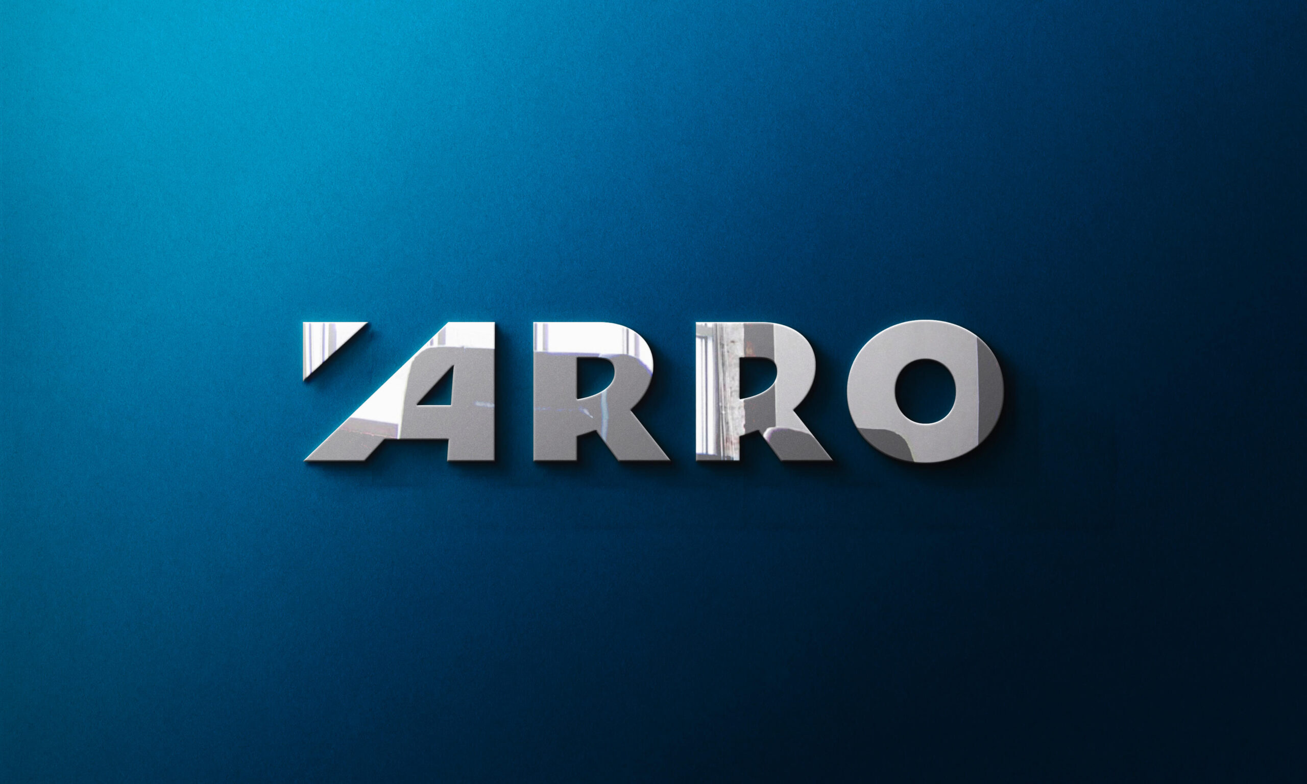
Concept Two
Concept Three
Concept One
The mark uses the simplest and most literal interpretation of the word, “arrow.” The yellow triangle adds structure to the modified logotype by creating an invisible block around the design.
The custom “A” adds leans into the logo to add movement to the design while the modified “R” alludes to the curves of a bow. Concept one’s palette uses the parent company’s colors as a starting point then adds yellow for a bright pop.


Visual Identity
Concept one leans into the logotype’s thick bold lines while adding a light-hearted and playful touch through the use of pattern.
Created from the yellow arrow found in the logo, the pattern resembles wings to symbolize the hope brought by first responders, while also giving off a slight military vibe.


Concept Two
While the logo for concept two was made by HDM’s Creative Director, I was tasked with interpreting the logo across different branded touchpoints.
The color palette is the same as the parent company’s existing color scheme to make it recognizable and create consistency across the two brands.

Visual Identity
Designs were inspired by the movement in the arrow’s arc while using accentuating stars and stripes to heavily allude to the military.
Design options, including this one, relied on stock photography in order to easily access photos of first responders and military personnel. While the branding of this concept leans into the military, the photos chosen represent the various target audiences for ARRO.


Concept Three
The logo uses a modified typeface with lowered crossbars to resemble the visual language found in tech logotypes.
The mark adds a bit of a natural element by having an arrowhead growing out of the ground and shooting into the sky. Option three also provides the client the added benefit of spelling out the ARRO acronym.


Visual Identity
Subtle use of the American flag is a nod to ARRO’s use in the military while helping add a layer of depth and texture to the brand.
The visual identity takes a more geometric approach— offering small glimpses of the technology’s intended audience—while leaning more in the the vibrant green of this option’s palette.


Next Steps
I thoroughly enjoyed ideating and designing the three different interpretations to the word, “arrow” and being able to take part in the first stages of the new brand.
While I wasn’t able to see the project through any subsequent design phases, the client did choose to move forward with the logo and design direction provided in Option One.
Hot Dog Marketing
Strategy
Kevin Ring
Art Director
Brandon Cornwell
Marketing Director
Cathy Edison
Copywriter
Tom Snyder
Personal Contributions: Visual Brainstorming + Ideation, Mark and Logo Design (for Concepts 01 & 03), Expanding Existing Color Palettes (for Concepts 01 & 03), Typeface Selection, Visual Identity (Business Cards & Letterhead), Hero Mockups
©2025 CJakubo. All Rights Reserved.