Homebase
Homebase DAO combines crypto with prop tech to give an entire generation, typically priced out of the real estate market, a chance at home and property ownership. The goal of the web3 company is to be the world’s first DAO to lower the current financial barrier while providing good returns to all community members.
The startup needed a new brand to establish them in the tech space while creating a distinct visual language for their community to stand behind.
- Branding
- Visual Identity
- Merch
Mark + Logo
Secondary Marks
Color Palette
Icons + Graphics
Merch + Brand Book
Mark
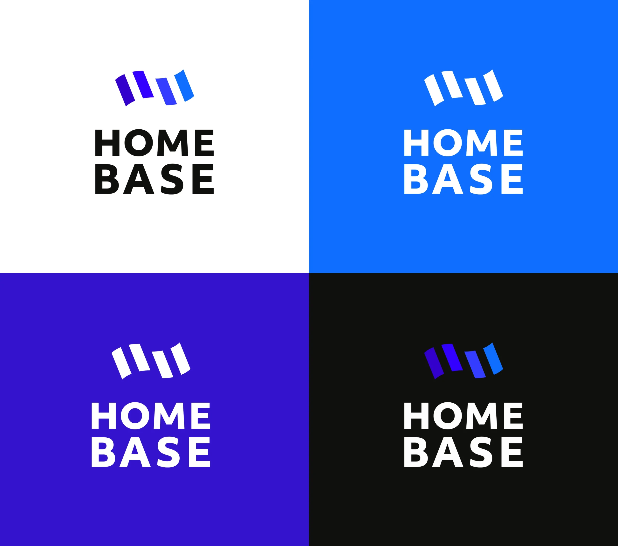
The name Homebase brought up images of old school games, like capture the flag. Since the startup was staking their claim over a relatively uncharted territory, a flag was the perfect mark.
The power of a DAO comes from the power that a collective of people have when pooling together their resources. Homebase’s mark is an abstracted flag made of individual units that combine to represent a whole.

Logo
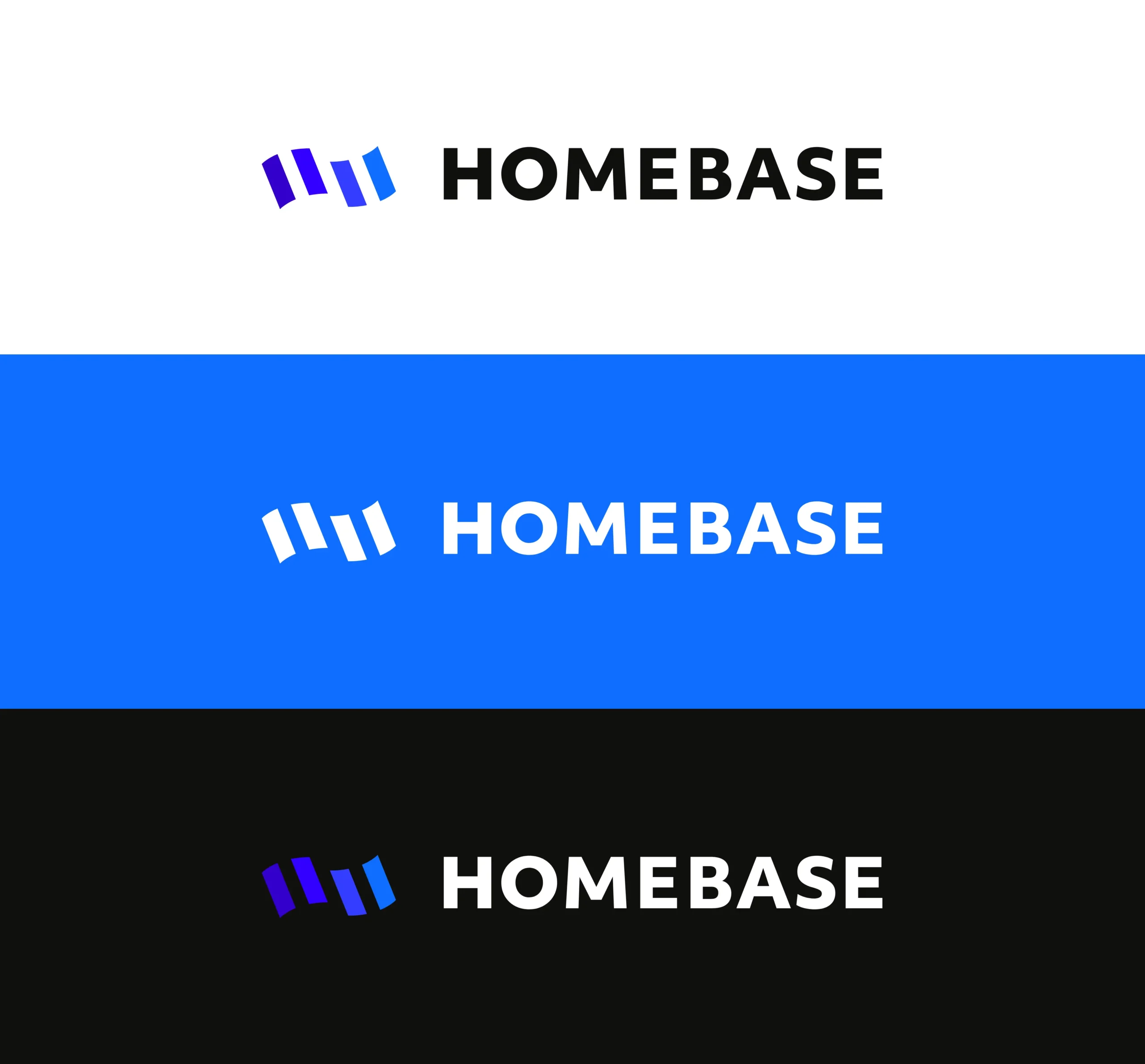
Simple, yet professional, Homebase’s logo pairs their mark of the abstracted flag with a geometric sans serif.
The stacked logo fits nicely into a square, continuing the idea of a sturdy, structured company. A horizontal version was also created for additional flexibility.
Secondary Marks
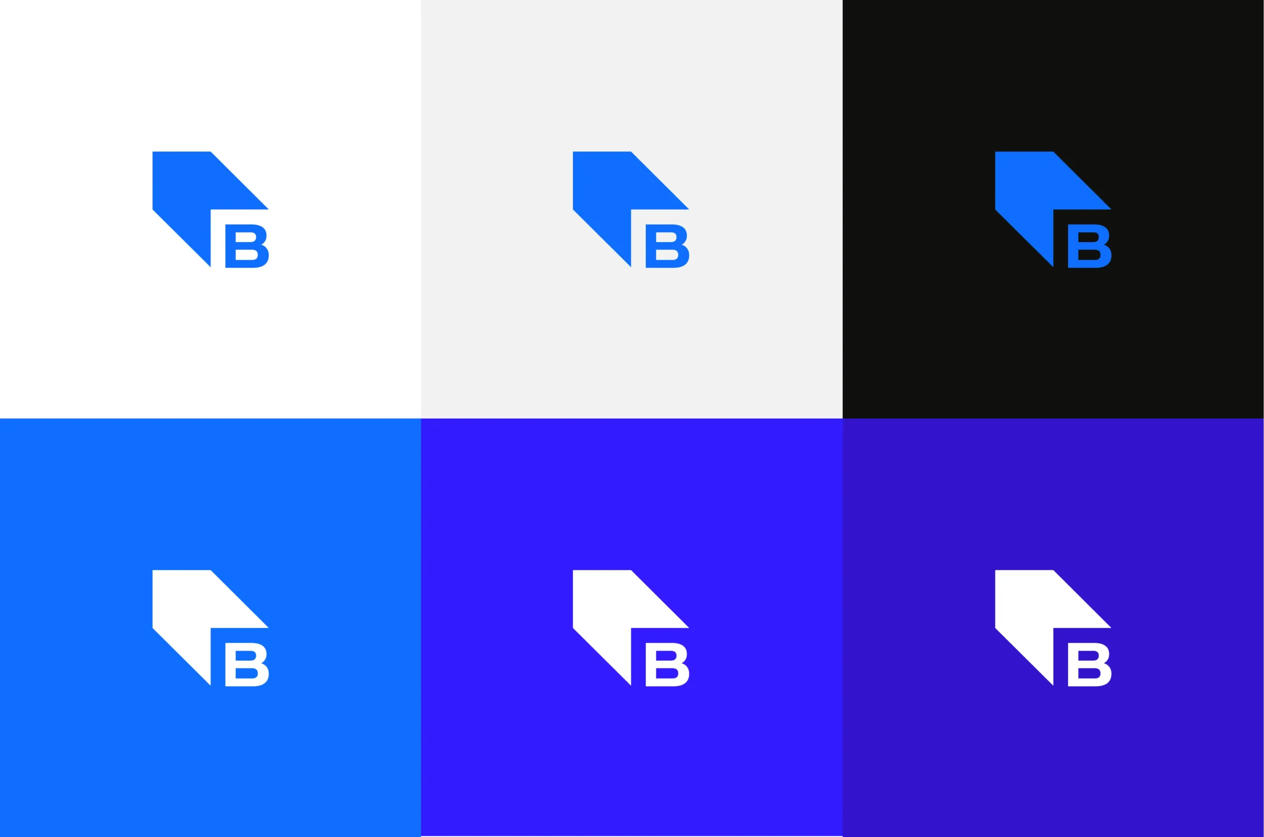
A secondary mark was also created to work as a supplementary signature for the brand.
Something of a monogram, it keeps the square “H” and extends it into a 3D square with their “B”. It scales at the smallest of pixels, just like Homebase’s mark.
Color palette
Blue was the startup’s original brand color. For the rebrand it was adjusted and expanded into a range of blue/purple hues to create a gradient of blurple accents.
The blurple gradient gives Homebase enough flexibility to use across a variety of touchpoint and visually conveys the movement the company is trying to create. Light and dark colors help add contrast to the color palette.

Icons
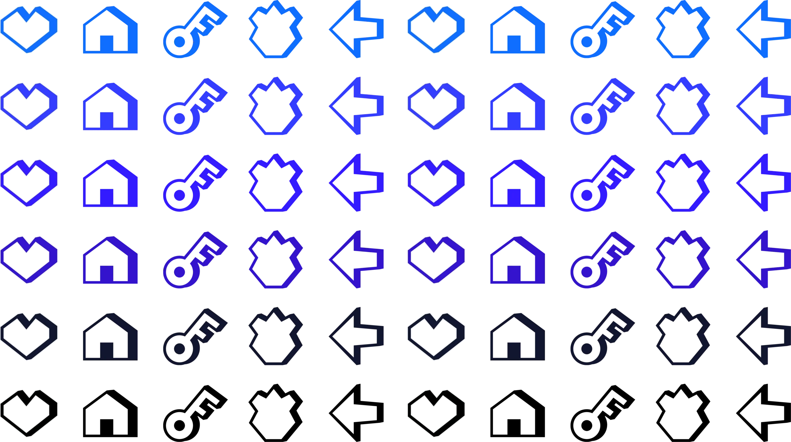
Part of Homebase’s rebrand includes an ongoing set of custom icons that leans into the brand’s more playful side.
Fitting within the retro visual language commonly found in the web3 space, Homebase’s icons are inspired by old computer graphics: wingdings and 8-bit.
ASCII Graphics
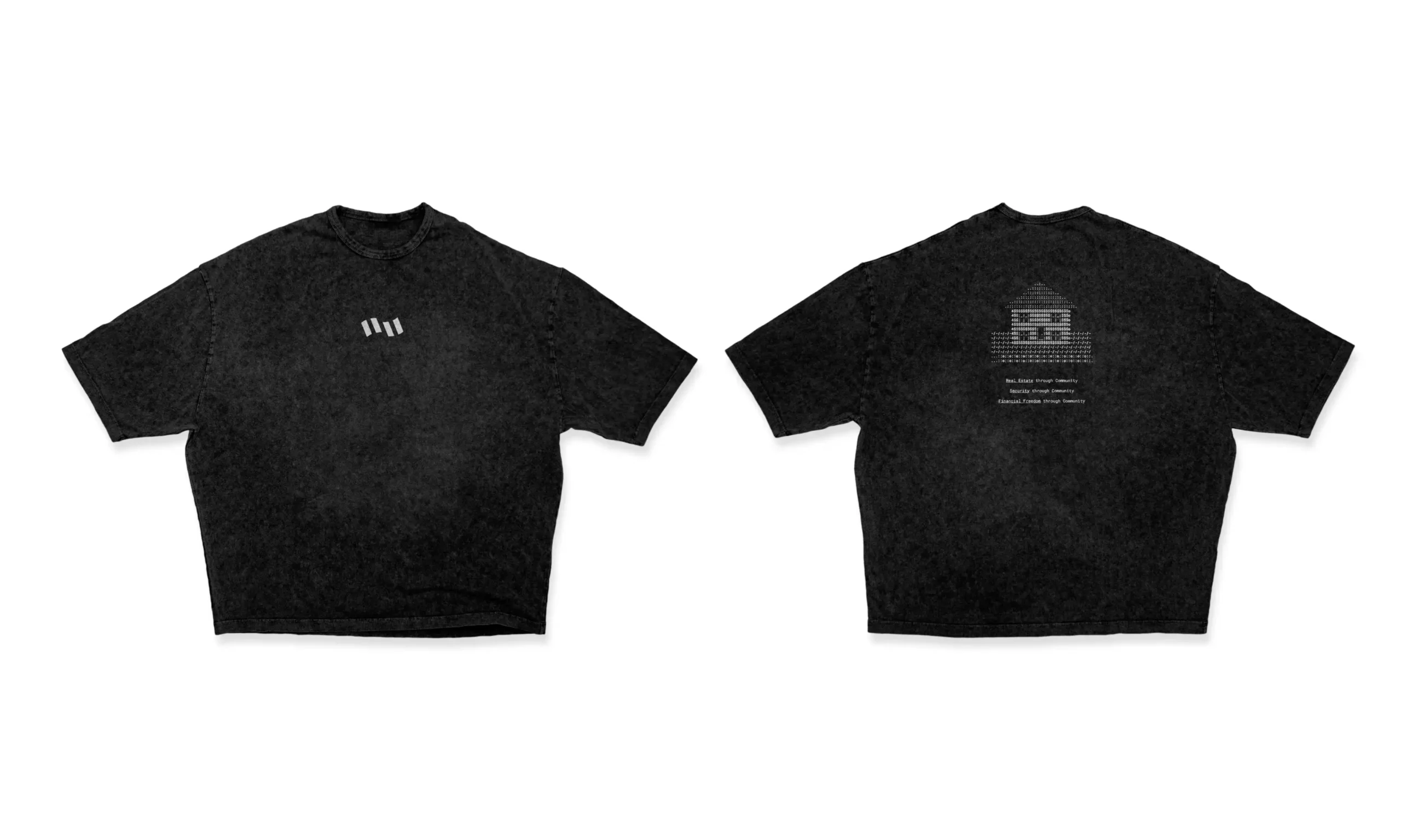
One of Homebase’s branded elements is the addition of the “Newskool” ASCII graphics, popularized in the late 1990s.
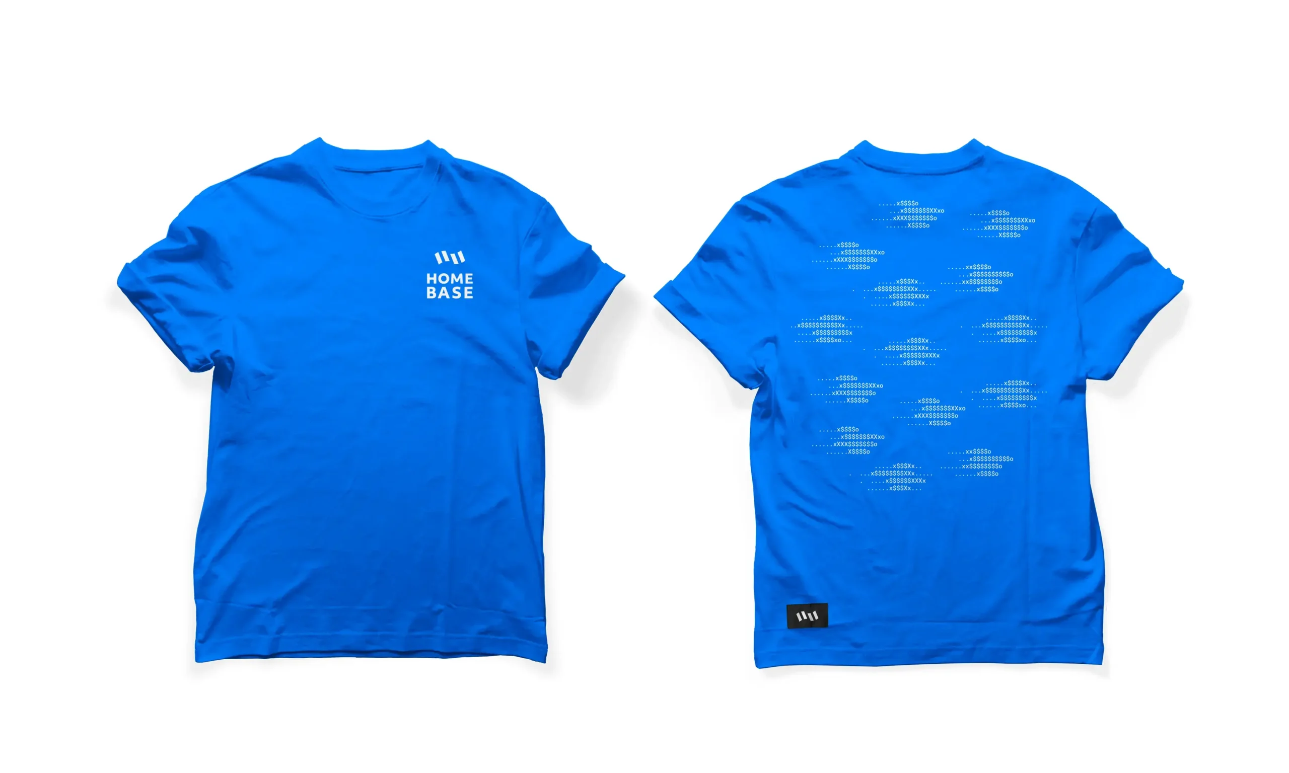
The use of ASCII ties back into the popular retro aesthetic of crypto, but with a newer take. ASCII graphics are digital but have the appearance of cross stitch — bringing about ideas of home and homemaking — adding a tactical element.

Merch
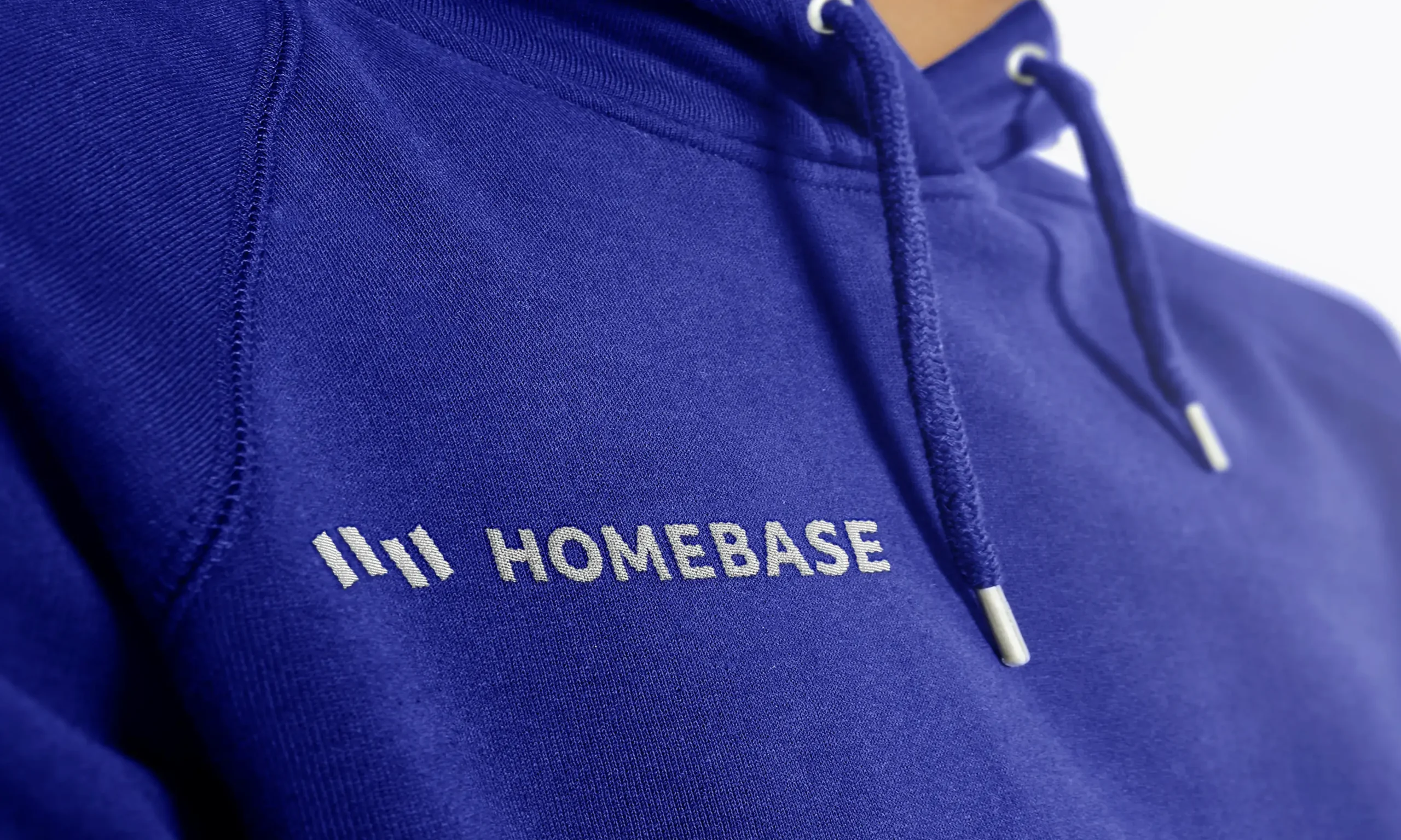
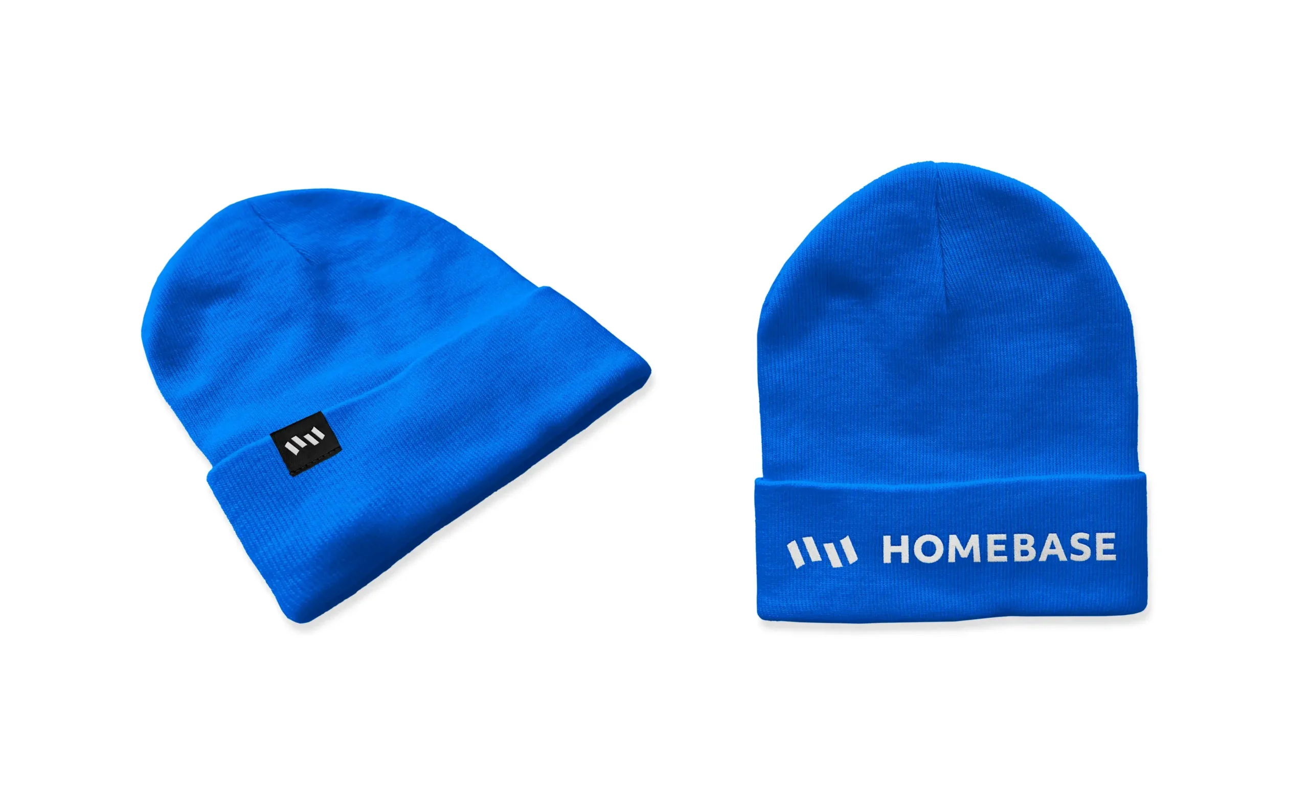
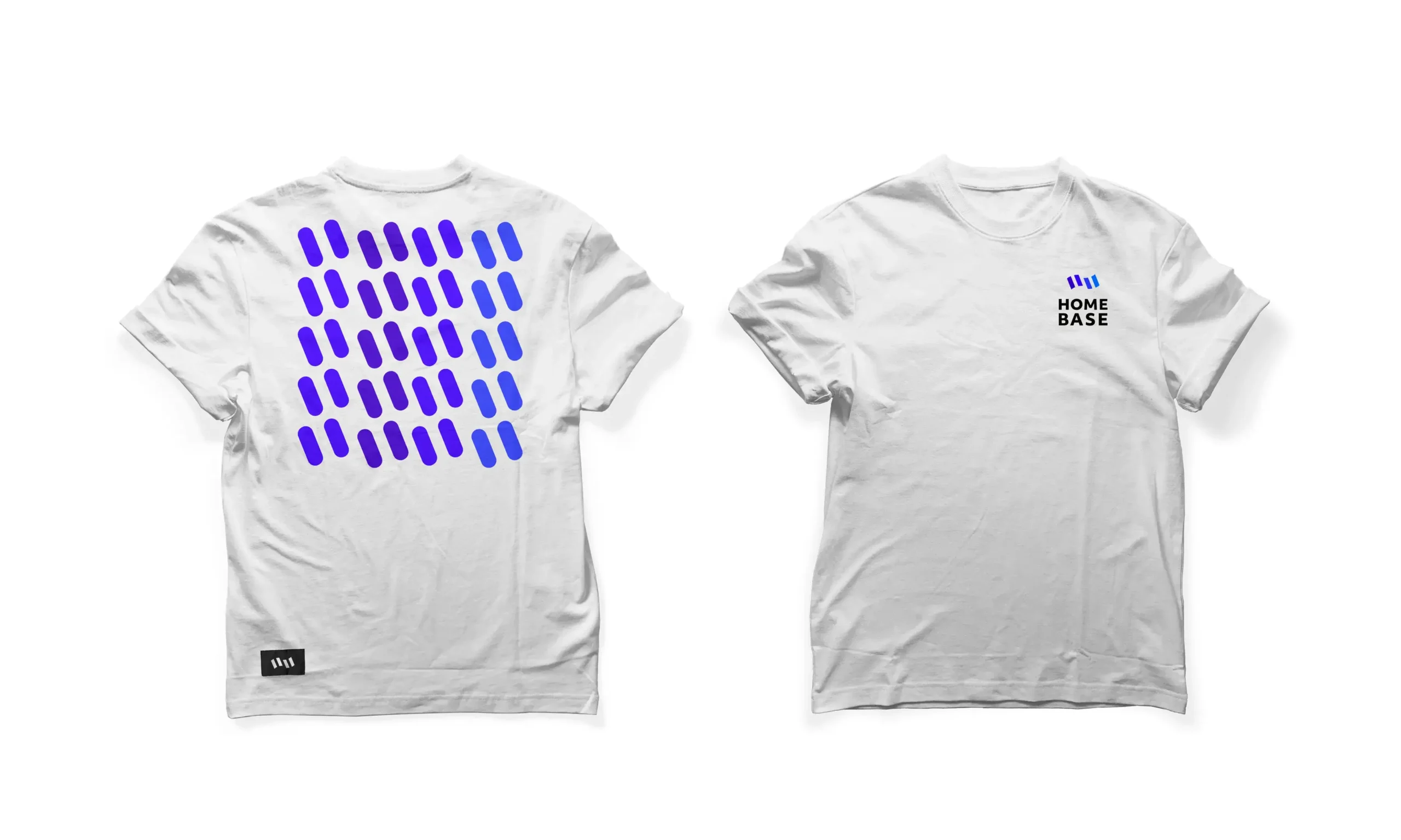
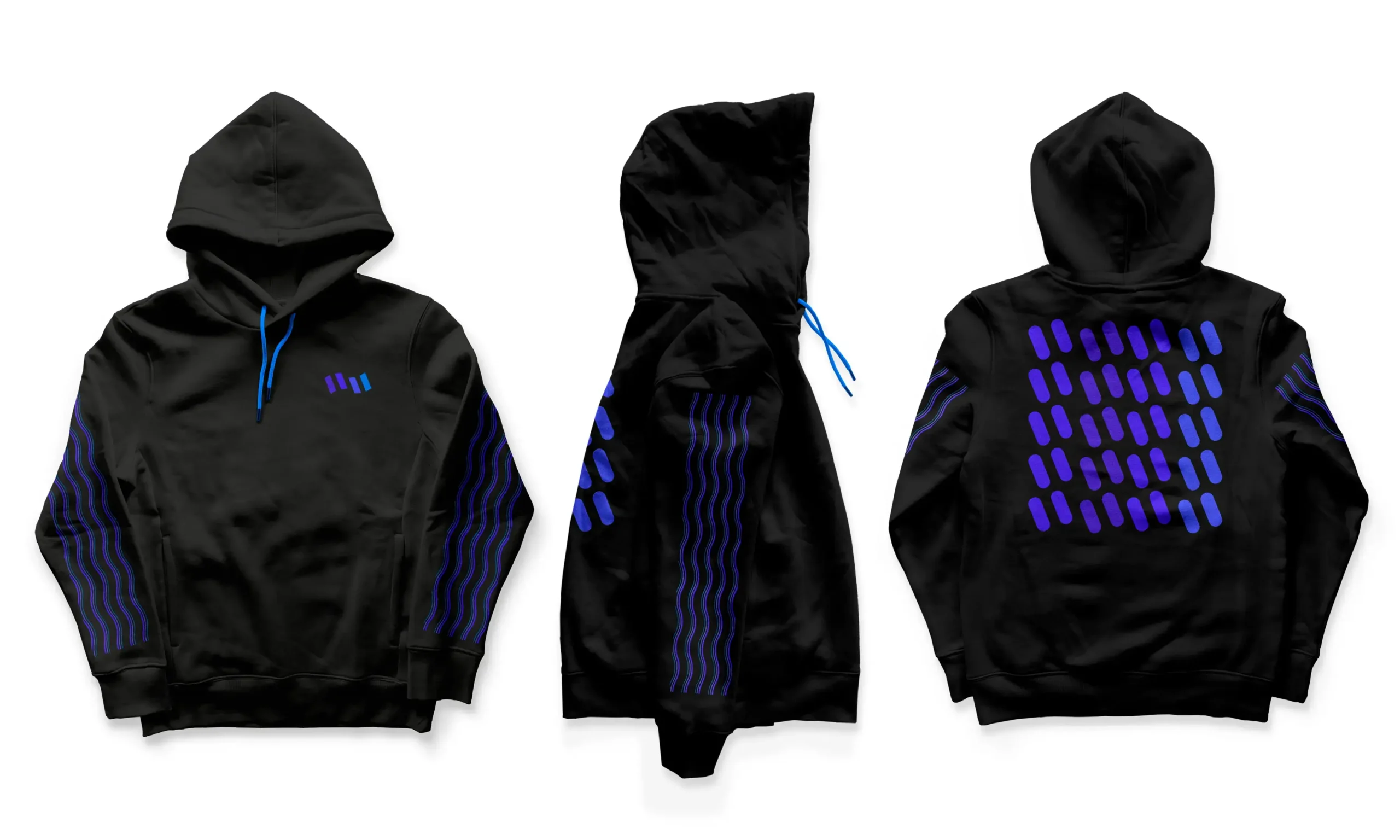
Part of their visual identity, Homebase’s merch provides a subtle way for their community to rep their brand offline and on.
To keep the casual vibe of their community, the designs and items chosen are made for the work-from-home, loungewear, athleisure, casual crowd.
Brand book
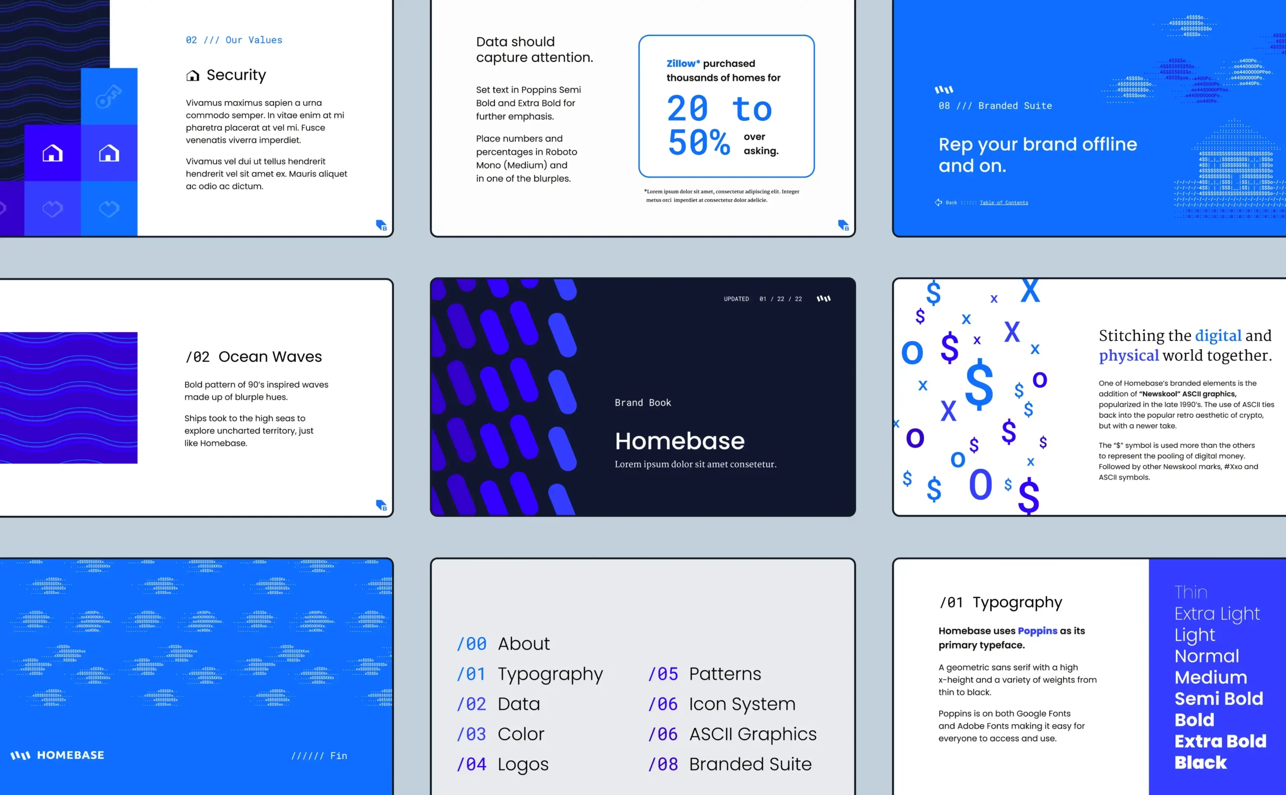
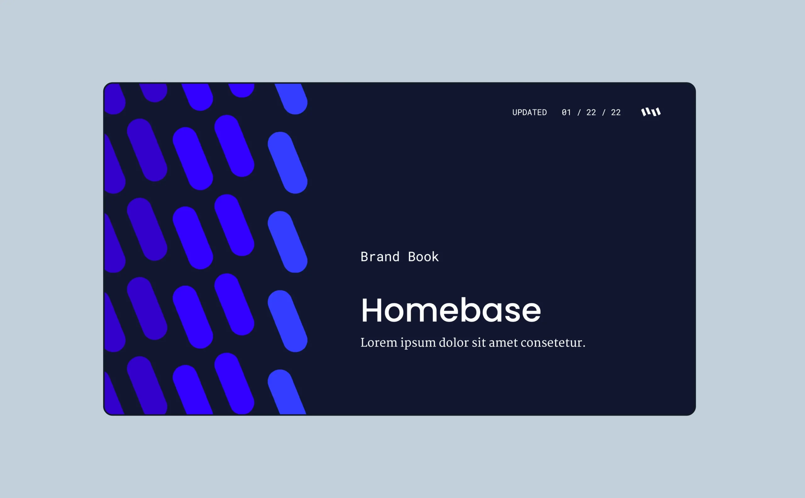
The startup’s brand book was intentionally created in Google Slides to make it easier for the digital only company to easily share.
Containing guidelines for logo and graphic usage, selection of Google Fonts, and a collection of visual assets, Homebase’s brand book provides a comprehensive breakdown of their rebrand for all.
©2025 CJakubo. All Rights Reserved.
